Using Omega
How to create and modify the theme's content.
How to create and modify the theme's content.
Optionally you can add a top bar on each page, if you add this markup after the <body>.
<div class="container">
    <div class="top top-left">
        add content for the left side of the topbar
    </div>
    <div class="top top-right">
        add content for the right side of the topbar
    </div>
</div>
Feel free to add what you want inside the right and left divs.
The header area <div id="masthead">...</div>
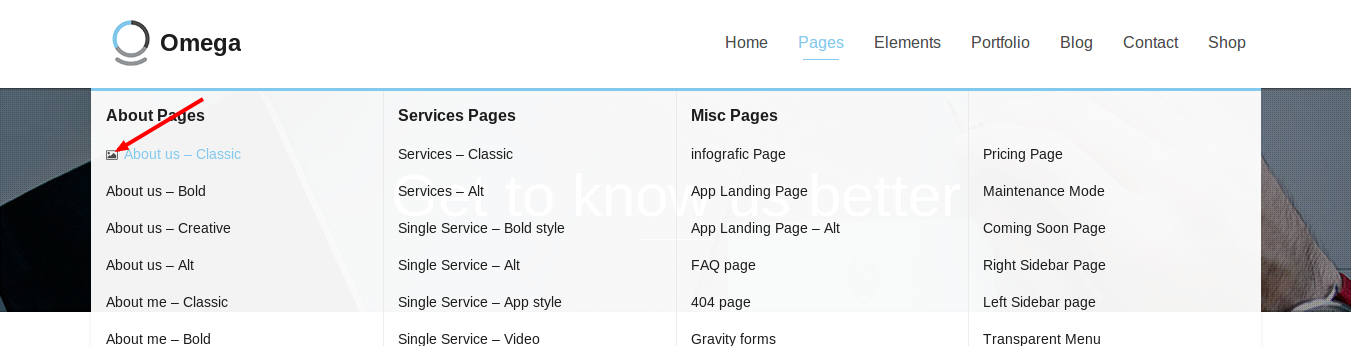
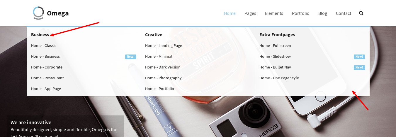
of the page contains the page Logo and the navigation list. The navigation follows bootstrap's responsive rules so in smaller screens it will collapse to a dropdown menu. You can read more about the markup of the navigation in bootstrap’ s
website.
A sticky menu is a menu that scrolls along with the page. Setting a sticky menu is easy, try following these steps:
Add the navbar-sticky class to the <div> as in
<div id="masthead" class="navbar navbar-sticky swatch-white" role="banner">Open theme.js in assets/js folder and locate this code
   var oxyThemeData = oxyThemeData || {
       navbarHeight : 90,
       navbarScrolled : 70,
       navbarScrolledPoint : 200,
       navbarScrolledSwatches: {
           up: 'swatch-white',
           down: 'swatch-white'
       },
       scrollFinishedMessage : 'No more items to load.',
       hoverMenu : {
           hoverActive : false,
           hoverDelay : 1,
           hoverFadeDelay : 200
       },
       siteLoader: 'on'
   };
From the navbarScrolledSwatches attribute set a color swatch for the up and down properties. The down property will define the color swatch that the menu will have when scrolling down and the up the color swatch when the user scrolls to the top.
Note: You can set the color swatches individually for each page by adding this script in the desired page
 <script type="text/javascript">
     var oxyThemeData = {
         navbarHeight : 90,
         navbarScrolled : 70,
         navbarScrolledPoint : 200,
         navbarScrolledSwatches: {
             up: 'swatch-black',
             down: 'swatch-white'
         },
         scrollFinishedMessage : 'No more items to load.',
         hoverMenu : {
             hoverActive : false,
             hoverDelay : 1,
             hoverFadeDelay : 200
         },
         siteLoader: 'on'
     };
 </script>
You can now have a different menu color for each page.
For a menu with a logo on the left, a navigation list and a search widget on the right side use the following markup
<div id="masthead" class="navbar navbar-sticky swatch-white" role="banner">
    <div class="container">
        <!-- setting a logo -->
        <div class="navbar-header">
            <button type="button" class="navbar-toggle collapsed" data-toggle="collapse" data-target=".main-navbar">
                <span class="icon-bar"></span>
                <span class="icon-bar"></span>
                <span class="icon-bar"></span>
            </button>
            <a href="../index.html" class="navbar-brand">
                <img src="assets/images/omega.gif" alt="One of the best themes ever">Omega
            </a>
        </div>
        <!-- setting a logo end-->
        <nav class="collapse navbar-collapse main-navbar" role="navigation">
            <!-- for a search widget -->
            <div class="menu-sidebar pull-right">
                <div id="search-4" class="sidebar-widget  widget_search">
                    <div class="top-search">
                      <form role="search" method="get" id="searchform" action="blog-classic.html">
                          <div class="input-group">
                              <input type="text" value="" name="s" id="s" class="form-control" placeholder="Search">
                              <span class="input-group-btn">
                                  <button class="btn" type="submit" id="searchsubmit" value="Search">
                                      <i class="fa fa-search"></i>
                                  </button>
                              </span>
                          </div>
                      </form>
                      <i class="fa fa-search search-trigger navbar-text"></i>
                      <svg class="search-close" preserveAspectRatio="none" version="1.1" viewBox="0 0 100 100" xmlns="http://www.w3.org/2000/svg"><path d="M25 25 L75 75" stroke-width="2"></path><path d="M25 75 L75 25" stroke-width="2"></path></svg>
                    </div>
                </div>
            </div>
            <!-- for a search widget end-->
            <ul class="nav navbar-nav navbar-right">
                <li class="dropdown">
                    <a href="#" class="dropdown-toggle" data-toggle="dropdown">Home</a>
                    <ul class="dropdown-menu">
                        <li><a href="index.html">v1. Home-Classic</a></li>
                        <li><a href="business.html">v2. Home-Business</a></li>
                        ...
                    </ul>
                </li>
                ...
            </ul>
        </nav>
    </div>
</div>In the theme.js located in the assets/js folder you can locate this script at the top of the file
var oxyThemeData = oxyThemeData || {
    navbarHeight : 90,
    navbarScrolled : 70,
    navbarScrolledPoint : 200,
    navbarScrolledSwatches: {
        up: 'swatch-white',
        down: 'swatch-white'
    },
    scrollFinishedMessage : 'No more items to load.',
    hoverMenu : {
        hoverActive : false,
        hoverDelay : 1,
        hoverFadeDelay : 200
    },
    siteLoader: 'on'
};Another amazing feature that you can enable in Omega is the transparent header. In order to have a transparent header you need to add the transparent-header class to the <body> as
in
<body class="transparent-header"> ... </body>Keep in mind that the transparent header needs to have an appropriate color swatch. For example, when the transparent header overlaps with a background image that is of a dark color, it needs to have a color swatch with white color
for the text e.g swatch-black.
In addition, the user can load a separate logo image that will load once he scrolls down and the menu becomes opaque. The initial image will load back when the user scrolls to the top of the page and the menu becomes transparent again.
In order to do that, you need to add some Css rules.
// Transparent logo switch
@media (min-width: 992px) {
    .transparent-header #masthead .navbar-brand {
        background-image: url('../../assets/images/restaurant/logo-transparent.png');
    }
    .transparent-header #masthead .navbar-brand img {
        visibility: hidden;
    }
    .transparent-header #masthead.navbar-scrolled .navbar-brand {
        background-image: none;
    }
    .transparent-header #masthead.navbar-scrolled .navbar-brand img {
        visibility: visible;
    }
}
Add the image that you want to be shown when the menu is transparent, in the first rule, replacing 'logo-transparent.png' The image that will be shown once the menu is opaque, is the one that the user has set inside the menu markup, i.e
<a href="../index.html" class="navbar-brand">
<img src="assets/images/lambda.gif" alt="One of the best themes ever">Lambda
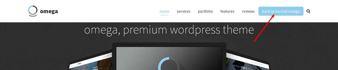
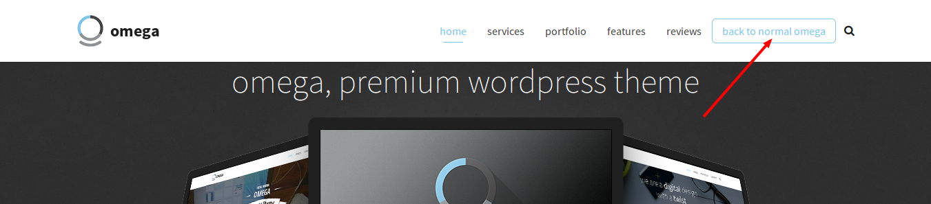
</a>A menu item can have the look of a button if you add the nav-highlight class to the <li></li> that holds the item e.g.
<li class="nav-highlight"><a href="your_link">back to normal omega</a></li>
<li role="presentation" class="divider"></li>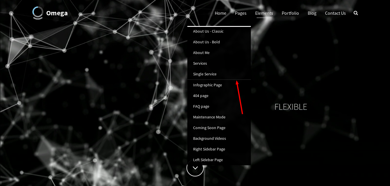
A menu can have icons next to the each menu item. You can use the font-awesome icons and the following markup to achieve that e.g
<i class="menu-icon fa fa-photo"></i>
The menu comes with a search widget, which has the following markup
<div id="search-4" class="sidebar-widget  widget_search">
    <form role="search" method="get" id="searchform" action="blog-classic.html">
        <div class="input-group">
            <input type="text" value="" name="s" id="s" class="form-control" placeholder="Search">
            <span class="input-group-btn">
                <button class="btn" type="submit" id="searchsubmit" value="Search">
                    <i class="fa fa-search"></i>
                </button>
            </span>
        </div>
    </form>
</div>Omega offers a Mega Menu, if you use the following markup
<ul class="nav navbar-nav navbar-right">
    <li class="dropdown menu-item-object-oxy_mega_menu ">
        <a href="#" class="dropdown-toggle" data-toggle="dropdown">Parent Menu Item Name</a>
        <ul class="dropdown-menu row">
            <li class="dropdown col-md-4 menu-item-object-oxy_mega_columns">
                <strong>Column Title</strong>
                <ul role="menu">
                    <li>
                        <a href="menu_item_link">Name of the menu link</a>
                    </li>
                    ... repeat this for each menu item
                </ul>
            </li>
            ... repeat this for each column(3 columns for col-md-4)
        </ul>
    </li>
</ul>
The content <div id="content" role="main"> ...</div> area hosts the main content of the theme. It is divided in sections to visually and semantically separate the content.
Sections are defined using the following HTML5 markup
<section class="section">
    <div class="container">
        Content goes here…
    </div>
</section>
Additional classes can be applied to the section to style the content.
A section can be fullheight (have a height at minimum as the screen size) by assigning a class to the section: section-fullheight as in
<section class="section section-fullheight">
    <div class="container">
        Content goes here…
    </div>
</section>The following options can be used to setup your section
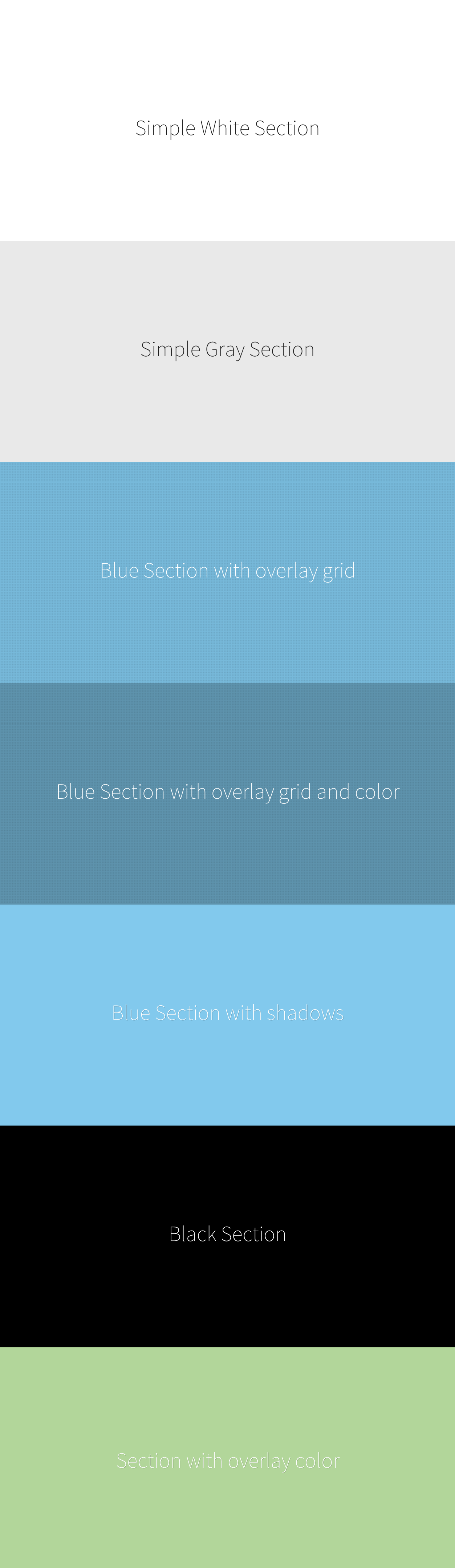
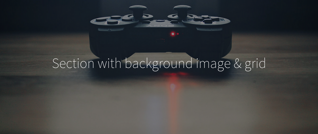
<div> inside the section will make it fullwidth.Using the following markup will add a background overlay (see image above)
<div class="background-overlay grid-overlay-20" style="background-color: rgba(0,0,0,0.2);"></div>Changing the grid-overlay class from grid-overlay-0 to grid-overlay-90 will set the overlay pattern image. Setting the rgba(0,0,0,0.2) sets the color overlay, with the last attribute(0.2) representing the opacity ranging from 0(transparent) to 1.
If a user wants to add a background image with background overlay, it is advised to use this markup
 <section class="section swatch-black section-text-shadow section-inner-shadow">
     <div class="background-media" style="background-image:url('yourUrl');background-repeat:no-repeat;background-size:cover;background-attachment:fixed;background-position:center 0%;"></div>
     <div class="background-overlay grid-overlay-20 " style="background-color: rgba(0,0,0,0.2);"></div>
     <div class="container-fullwidth">
         Content goes here…
     </div>
 </section>
This will add a background image fixed, aligned in the center.
If a user wants to create a section with a video as background, this markup should be used
 <div class="background-media">
     <video poster="your_poster" style="width: 100%; height: 100%;" loop autoplay class="section-background-video">
         <source type="video/mp4" src="your_audio.mp4">
         <source type="video/webm" src="your_audio.webm">
         <source type="video/ogg" src="your_audio.ogg">
     </video>
 </div>
A section with a background image can utilize the parallax effect, which will add a great sense of interactivity between the user and the website. Parallax scrolling is a special scrolling technique in computer
graphics, wherein background images move slower than foreground images, creating an illusion of depth and adding to the immersion. For the parallax effect to take place, two data attributes must be added
in the <div> of the background media, e.g
 <div class="background-media" style="background-image: url(background_img);" data-start="background-position: 50% 0px" data-70-top-bottom="background-position: 50% -90px">
 </div>
The background-position element of the data-start attribute has two parameters. The first parameter defines the alignment of the image along the horizontal axis(50% = center). The second parameter
defines the movement along the axis as the user scrolls down(0 = no movement). The data-top-bottom attribute works the same way for the vertical axis.
data-color-duration: Set the length of time each color will stay active between changes, in milliseconds.
For example, a section with a color bundle would have this markup
  <section class="section swatch-black section-inner-shadow" style="background-color: rgb(211, 84, 0);" data-color-set="#d64541,#1ba39c,#d35400,#7b569f" data-color-speed="2000" data-color-duration="4000">
      <div class="container">
          Content goes here…
      </div>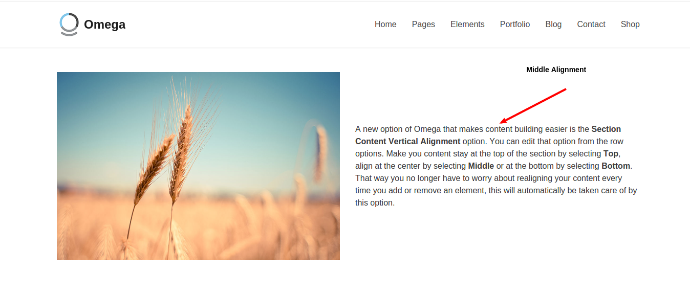
</section>A new option of Omega that makes content building easier is the Section Content Vertical Alignment option. You can enable that by adding to the <row>the class vertical-middle for
the content to be aligned with the middle of the section, vertical-bottom for it to be aligned with the bottom or no class to be aligned with the top of the section. That way you no longer have to worry about
realigning your content every time you add or remove an element, this will automatically be taken care of by this option. E.g.
<section class="section swatch-white">
    <div class="container">
        <div class="row vertical-middle">
            <div class="col-md-6">
                <img alt="" src="some_img">
            </div>
            <div class="col-md-6">
                <p>I am text block.</p>
            </div>
        </div>
    </div>
</section>
Headers are most commonly used in the beginning of a section to create an impressive title. Feel free though to use them wherever you like inside your sections. The following markup should be used
<header class="condensed">
    <h1 class="hyper hairline bordered bordered-normal">
      we are a digital <strong>design</strong> agency with a twist
    </h1>
    <p class="lead">subtitle</p>
</header>
The following options can be used to setup the header:
<h1>.<p></p> will be used as subtitle. Adding the lead class will increase the font size.<header> can have the condensed class which adds padding to the sides of the heading creating a more condensed effect.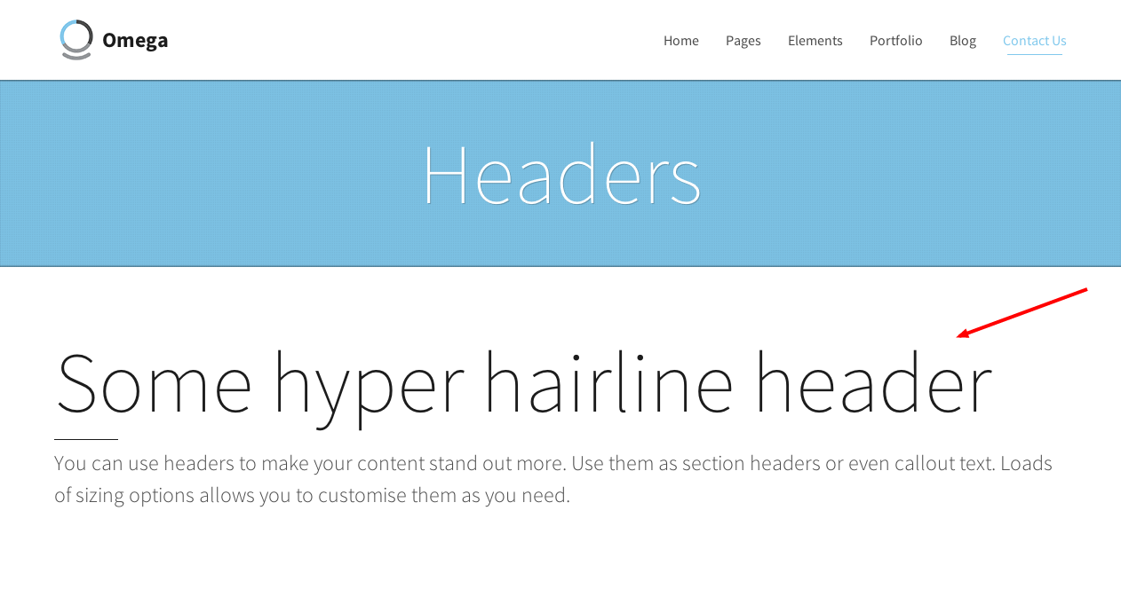
Omega is easy to build as an one-page website. In order to achieve that you need to make sure of two things. Firstly, you need to assign to the sections that you want to scroll to a specific unique id as in
<section class="section" id="home">
...
</section>
Secondly, you need to make sure that each menu item links to the desired section, by assigning to the href attribute the # symbol followed by the id of the section as in
<a class="dropdown-toggle" title="Home" href="#home" data-toggle="dropdown">Home</a>As a result, when you click on the Home menu item, you will be scrolled to the home section of the page. For example, if we had a page with three sections, it would look like this
<body>
    <div id="content">
        <article>
            Add your menu here
            <section class="section" id="home">
            ...
            </section>
            <section class="section" id="services">
            ...
            </section>
            <section class="section" id="portfolio">
            ...
            </section>
        </article>
    </div>
</body>
Now you have to connect your menu item links to your sections, so you will make the href attribute of each <a> point to your sections. You should build your menu according to the Menu Header section.
For the above example, replace this chunk of code
<ul class="nav navbar-nav navbar-right">
    <li class="dropdown">
        <a href="#" class="dropdown-toggle" data-toggle="dropdown">Home</a>
        <ul class="dropdown-menu">
            <li><a href="index.html">v1. Home-Classic</a></li>
            <li><a href="business.html">v2. Home-Business</a></li>
            ...
        </ul>
    </li>
    ...
</ul>
with this
<ul class="nav navbar-nav navbar-right">
    <li class="active current-menu-item"><a href="#home">Home</a></li>
    <li class=""><a href="#services">Services</a></li>
    <li class=""><a href="#portfolio">Portfolio</a></li>
</ul>
Now you have menu items that link to your sections and the user will scroll to each section when clicking on the respective link.
<a href="#home" class="scroll-to scroll-to-id">
    Click me to scroll to home section
</a>To create a page with a sidebar use the following markup
<section class="section">
<div class="container">
<div class="row">
<div class="col-md-9">
Main content
</div>
<div class="col-md-3 sidebar">
<div class=”sidebar-widget”>
<h3 class=”sibebar-header”>
widget content
</h3>
</div>
<div class=”sidebar-widget”>
<h3 class=”sibebar-header”>
widget content
</h3>
</div>
</div>
</div>
</div>
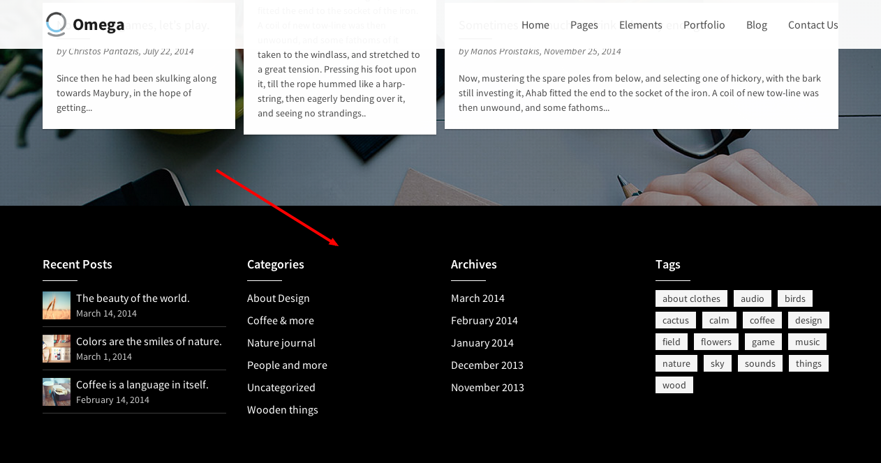
</section>Omega supports search, categories, tag cloud, recent posts, archive, text and twitter widgets (by using the classes widget_search, widget_categories, widget_tag_cloud, widget_recent_entries, widget_archive, widget_text and widget_oxy_twitter classes), but you can use any type of content on your sidebar.
The footer area <footer id="footer"> ... of the page contains the page's footer and requires the following markup
<footer id="footer" role="contentinfo">
  <section class="section swatch-black">
    <div class="container">
      footer content here
    </div>
  </section>
<footer>
Use a different swatch instead of the swatch-black if you want to change the colors of the footer. If you want to setup your footer's columns use the following markup
<div class="row">
    <div class="col-md-3">
        add content here
    </div>
    <div class="col-md-3">
        add content here
    </div>
    <div class="col-md-3">
        add content here
    </div>
    <div class="col-md-3">
        add content here
    </div>
</div>
This will create a 4-column footer. Use a 3 column footer by adding 3 divs with a col-md-4 class.
If you want to set margins between elements, you can use the following classes anywhere that you want: element-normal-top, element-normal-bottom, which add 72pxs of padding to the top/bottom respectively.
In addition, these classes can be used : element-no-top(0px), element-no-bottom(0px), element-short-top(24px), element-short-bottom(24px), element-medium-top(48px), element-medium-bottom(48px), element-tall-top(96px), element-tall-bottom(96px).
Some more classes you can use are:
Some more classes that can be used to underline a header are:
Omega offers a variety of classes that will make your typography stand out. In order to set the font size, we can use the big class (36px), bigger class (48px), the super class (60px), or the hyper (96px) class. E.g
<h1 class="text-center normal">This is a normal sized title</h1>In case we want to underline the text we can use the bordered class.
Omega offers three classes to align your text left, right or in the center. They are text-left, text-right and text-center respectively.
Omega offers three classes to align your text left, right or in the center for mobile devices. They are small-screen-left, small-screen-right and small-screen-center respectively.
Make your text stand out by assigning different weights through these classes: black, bold, regular, light, hairline.
Assigning the following classes to a text will make them uppercase, lowercase and italic respectively: text-caps, text-lowercase, and text-italic. In addition, assigning the text-none class removes all the transformations that might have been inherited from parent elements.e.g
<h1 class="text-center normal text-caps">This is a normal sized title
    <p class="text-none">this is a subtitle with no transformations</p>
</h1>Omega comes with a set of theme related components that you can use along with the bootstrap components.
Color Swatches are what give Omega its nice colorful look. Each color swatch is consisted of different combinations of colors for most of the theme's components, offering the user the ability to fully customize Omega to his own needs. Different color swatches can be assigned to sections to achieve different styling throughout the pages. For example, if we would like to have a white background with red elements, we would assign the swatch-white-red class to the section like this
<section class="section swatch-white-red">
    <div class="container-fullwidth">
        Content goes here…
    </div>
</section>
More color swatches that you can use with Omega are swatch-white-black, swatch-white-green, swatch-black, swatch-gray, swatch-blue, swatch-white.
In order to create a new color swatch, a new set of CSS rules needs to be created and added to a new file that you will create. Move the new file into the /assets/css folder and include it in the header.
If you want to change the default colors of Omega, you need to replace the contents of the color-defaults.css file in the /assets/css folder. The pocedure is similar to creating a new color swatch. To do so, follow these simple steps
Omega uses flexslider to create impressive and responsive slideshows that respond even to touch events. The general markup used to create a slideshow is the following
<div class="flexslider" id="someID">
  <ul class="slides">
    <li>
      A slide (any content)
    </li>
    <li>
        Another  slide (any content)
    </li>
    …
  </ul>
</div>
You can control the behaviour of the slideshow by passing data attributes to the .flexslider div. The data attributes used are:
For example, to create a slideshow with navigation arrows and navigation controls outside the slideshow aligned to the left, that uses the effect “fade” and changes every 5 seconds you should use the following markup.
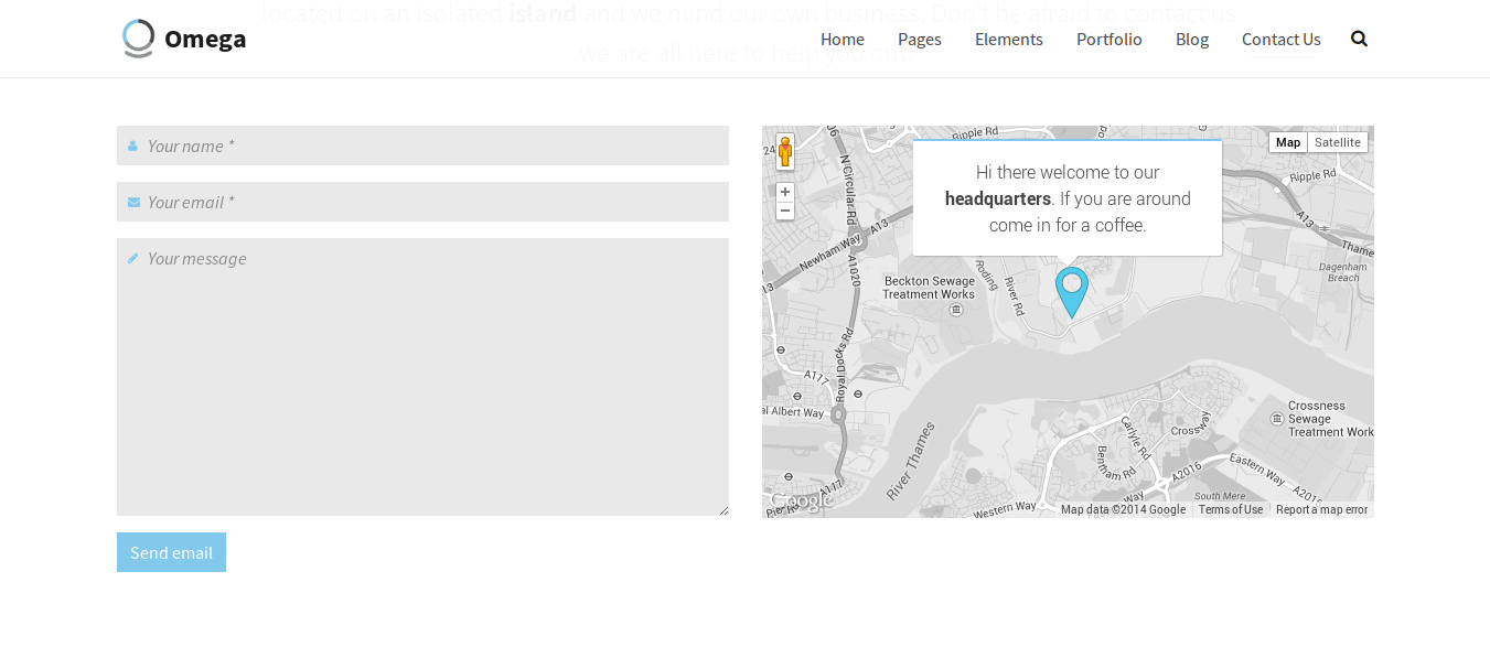
<div class="flexslider" data-flex-directions=”show” data-flex-directions-type=”simple” data-flex-controls=”show” data-flex-controlsalign=”left” data-flex-speed=5000 id="someID">Adding a map in Omega is pretty easy. What you need to do is add this markup wherever you want in your markup
<div class="google-map" id="map" style="height:354px;" ></div>You can adjust the height to your needs.
The map's settings can be easily modified from the start of the map.js or map.min.js, located in assets/js/.
map_type: 'ROADMAP',
map_zoom: 15,
map_style: 'blackwhite',
map_scrollable: 'on',
marker: 'show',
label: ['London Royal','Athens Bistro'],
address: '',
latlng : ['51.511084, -0.133202','51.506623, -0.111916'],
center_latlng: '',
markerURL: 'images/marker.png',
auto_center: true,<script src="https://maps.googleapis.com/maps/api/js?sensor=false"></script> and <script src="assets/js/map.min.js"></script> at the and of the <body>.
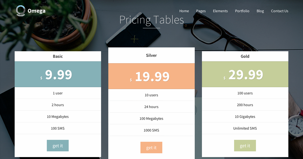
You can create a pricing table by using the following markup.
<div class="pricing-col
        pricing-featured
    ">
    <h2 class="pricing-head">Basic</h2>
    <div class="pricing-body">
        <div class="pricing-price">
            <div class="overlay">
                <h4>
                    <small>$</small>
                    9.99
                    <small>month</small>
                </h4>
            </div>
        </div>
        <ul class="pricing-list">
                <li>1 user</li>
                <li>2 hours</li>
                <li>10 Megabytes</li>
                <li>100 SMS</li>
        </ul>
        <a href="some" class="btn btn-lg btn-primary">get it</a>
    </div>
</div>
By using the pricing-featured class the pricing column stands out more by adding some extra padding.
If you want to create services you need to use the following markup
<div class="row">
  <li class="col-md-3">
    <div class="box box-round box-normal">
      <div class="box-dummy"></div>
      <a class="box-inner grid-overlay-10" href="some_link" target="_self" style="background-color:#e9e9e9;">
        <img src="image_source">
      </a>
    </div>
  </li>
  .
  .
  .
</div>
This will create a list of images. In order to read more on how to add a boxed image, go to shaped images.
Before closing the <li> you can set a header as in
<h3 class="text-center normal bold bordered bordered-small">
    <a href="some_link" target="_self">
    Some header</a>
</h3>
Add then any text that you want
<p class="text-center">
    We have designed this site mobile first so it looks great on mobile devices of all shapes and sizes.
</p>If you want to create a list of staff members you need to use the following markup
<div class="row staff-list-container list-container">
  add the single staff member markup
</div>
This markup for the staff member should be like that
<div class="figure fade-in">
  <a href="some link" class="figure-image" target="_self">
      <img src="image_url" alt="alt image" class="normalwidth">
  </a>
</div>
In addition, you can add an overlay effect like this
<div class="figure fade-in">
  <a href="some link" class="figure-image" target="_self">
    <img src="image_url" alt="alt image" class="normalwidth">
    <div class="figure-overlay grid-overlay-20">
      <div class="figure-overlay-container">
        <span class="figure-icon">
          <svg xmlns="http://www.w3.org/2000/svg" viewBox="0 0 100 100"><g fill="none"><path d="M50.941 34.953v30.094M65.988 50h-30.093"></path></g></svg>
        </span>
      </div>
    </div>
  </a>
</div>
you can use an image instead of an svg too.
Also you can add captions to the bottom of the figure e.g.
<div class="figure-caption text-center">
  <h3 class="figure-caption-title bordered bordered-small ">
      <strong>Jane Doe</strong>
      <span>Designer</span>
  </h3>
  <p class="figure-caption-description">In the center of the roof was a great light, as bright as the sun, which made the emeralds sparkle in a wonderful manner.</p>
</div>
Moreover, social items can be an option
<ul class="social-icons element-short-top element-short-bottom text-center">
    <li>
        <a href="your_link" target="_self" data-iconcolor="#3b5998">
            <i class="fa fa-linkedin"></i>
        </a>
    </li>
    <li>
        <a href="your_link" target="_self" data-iconcolor="#00acee">
            <i class="fa fa-twitter"></i>
        </a>
    </li>
</ul>
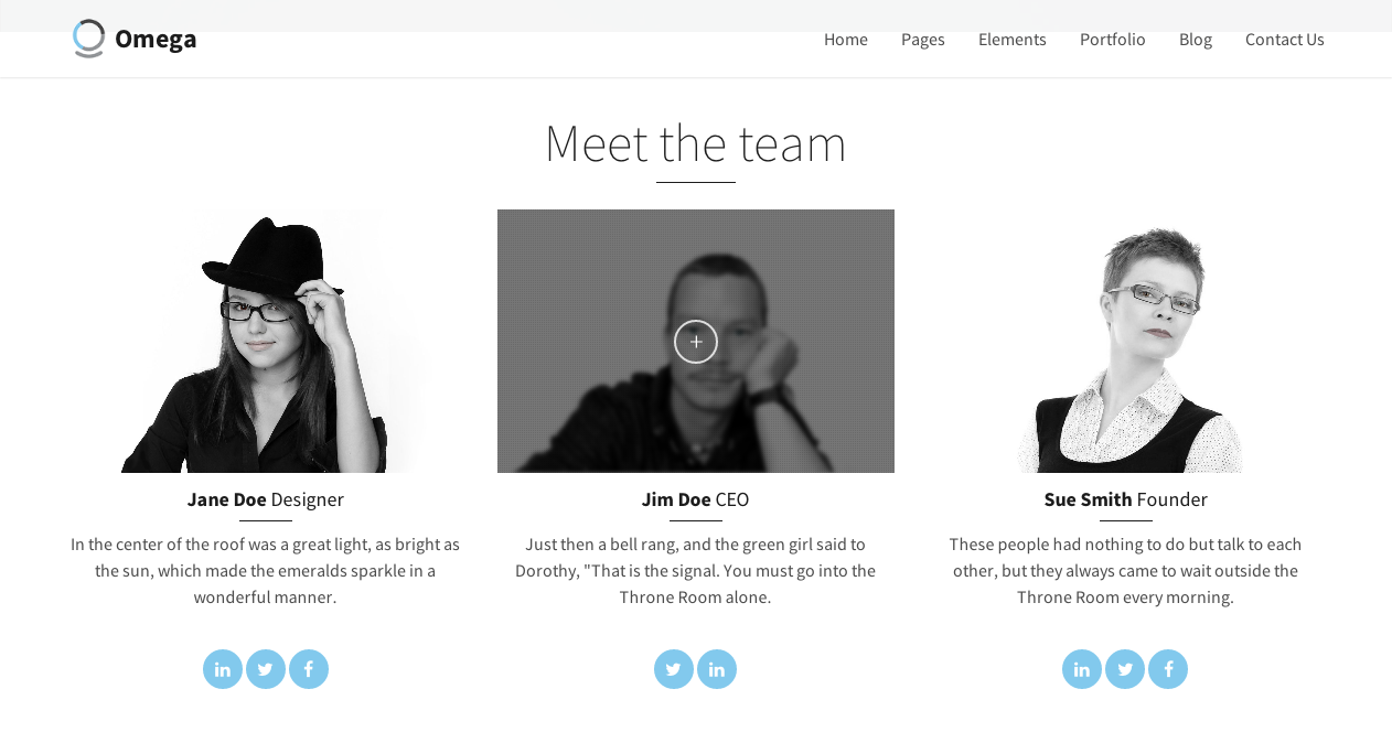 For more options on how to setup you staff images and on hover options take a look at the portfolio images
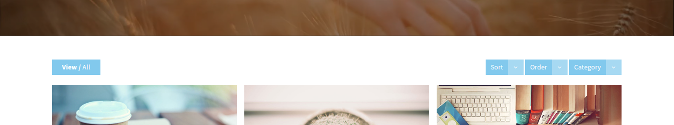
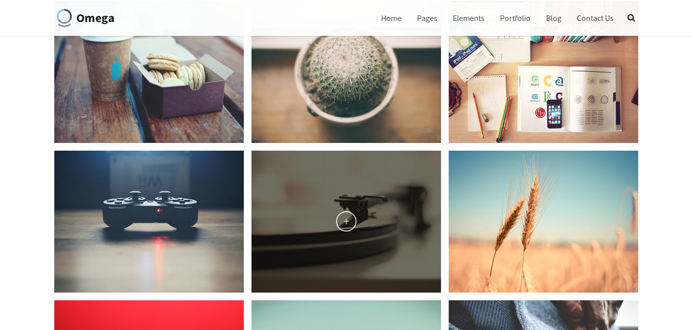
Omega's portfolio items offer you a wide variety of options to create a unique style of your work presentation. Read below for a detailed description of what you can achieve. You can create three different Portfolio items. Standard, Gallery and Video. Lets create a page with many portfolio items of each type, along with filters, using Isotope.
Setting filters is optional, but if you want to use them you can use the following markup
<div class="col-md-12">
    <div class="portfolio-header clearfix">
        <h3 class="portfolio-title pull-left">
            <strong>View /</strong> <span>All</span>
        </h3>
        <div class="portfolio-filters pull-right">
            <div class="btn-group">
                <button type="button" class="btn btn-primary dropdown-toggle btn-icon-right btn-sm" data-toggle="dropdown"><b>Sort</b>
                    <span>
                        <i class="fa fa-angle-down"></i>
                    </span>
                </button>
                <ul class="dropdown-menu pull-right" role="menu">
                    <li><a class="portfolio-sort" data-sort="default">Default</a></li>
                    <li><a class="portfolio-sort" data-sort="title">Title</a></li>
                    <li><a class="portfolio-sort" data-sort="date">Date</a></li>
                    <li><a class="portfolio-sort" data-sort="comments">Comments</a></li>
                </ul>
            </div>
            <div class="btn-group">
                <button type="button" class="btn btn-primary dropdown-toggle btn-icon-right btn-sm" data-toggle="dropdown"><b>Order</b>
                    <span>
                        <i class="fa fa-angle-down"></i>
                    </span>
                </button>
                <ul class="dropdown-menu pull-right" role="menu">
                    <li><a class="portfolio-order" data-value="true">Ascending</a></li>
                    <li><a class="portfolio-order" data-value="false">Descending</a></li>
                </ul>
            </div>
            <div class="btn-group">
                <button type="button" class="btn btn-primary dropdown-toggle btn-icon-right btn-sm" data-toggle="dropdown"><b>Category</b>
                    <span>
                        <i class="fa fa-angle-down"></i>
                    </span>
                </button>
                <ul class="dropdown-menu pull-right" role="menu">
                    <li><a class="portfolio-filter" data-filter="*">All</a></li>
                    <li><a class="portfolio-filter" data-filter=".filter-nature">Nature
                    journal</a></li>
                    <li><a class="portfolio-filter" data-filter=".filter-people">People and
                    more</a></li>
                    <li><a class="portfolio-filter" data-filter=".filter-things">Things</a></li>
                </ul>
            </div>
        </div>
    </div>
</div>
 If you want to set up category filters, you need to set up the data-filter attribute as in
<li><a class="portfolio-filter" data-filter=".filter-nature">Nature
journal</a></li>
Later on, when creating the portfolio item, you will assign to it that filter as class and it will show up when choosing the Nature journal category.
Firstly, we wrap all the portfolio items inside this div
<div class="portfolio-container">
    <div class="portfolio masonry isotope" data-padding="15" data-col-xs="2" data-col-sm="2" data-col-md="3" data-col-lg="3" data-layout="fitRows">
    put the items here....
    </div>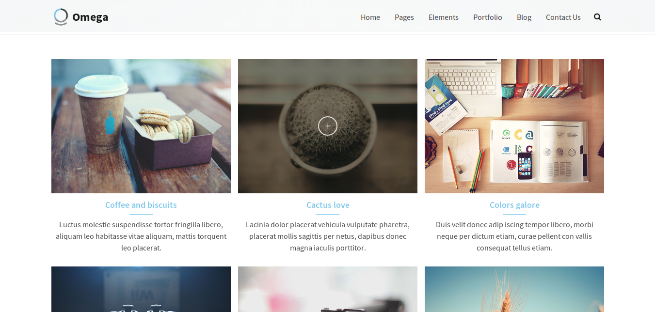
</div>The following markup is used to create a standard portfolio item, added inside the previous divs
<div class="masonry-item portfolio-item isotope-item" data-menu-order="1" data-title="Coffee and Biscuits">
    Add a portfolio image
</div>The portfolio image that you can use for the portfolio items should follow this markup
   <div class="figure portfolio-os-animation element-no-top element-no-bottom text-center figcaption-middle normalwidth image-filter-sepia fade-in image-filter-onhover" data-os-animation="fadeIn" data-os-animation-delay="0s">
        <a href="assets/images/uploads/image-03-normal.jpg" class="figure-image magnific" data-links="" target="_self">
            <img src="image_src" alt="Coffee and Biscuits" class="normalwidth">
            <div class="figure-overlay grid-overlay-30">
                <div class="figure-overlay-container">
                    <span class="figure-icon">
                        <svg xmlns="http://www.w3.org/2000/svg" viewBox="0 0 100 100"><g fill="none"><path d="M50.941 34.953v30.094M65.988 50h-30.093"></path></g></svg>
                    </span>
                </div>
            </div>
        </a>
    </div>
The options that you can set for a portfolio item are the following:
<a></a>) for a standard portfolio, the magnific-vimeo for video portfolio item or magnific-gallery for
the gallery portfolio item.<img>.
It is easy to add captions below the figure of the portfolio item if you add this markup after the <a></a> in the previous example
<h3 class="figure-caption-title bordered bordered-small bordered-link">
    <a href="your_link" target="_self">
        your title
    </a>
</h3>
You can add a description text as well using this markup
<p class="figure-caption-description">
    your description text
</p>
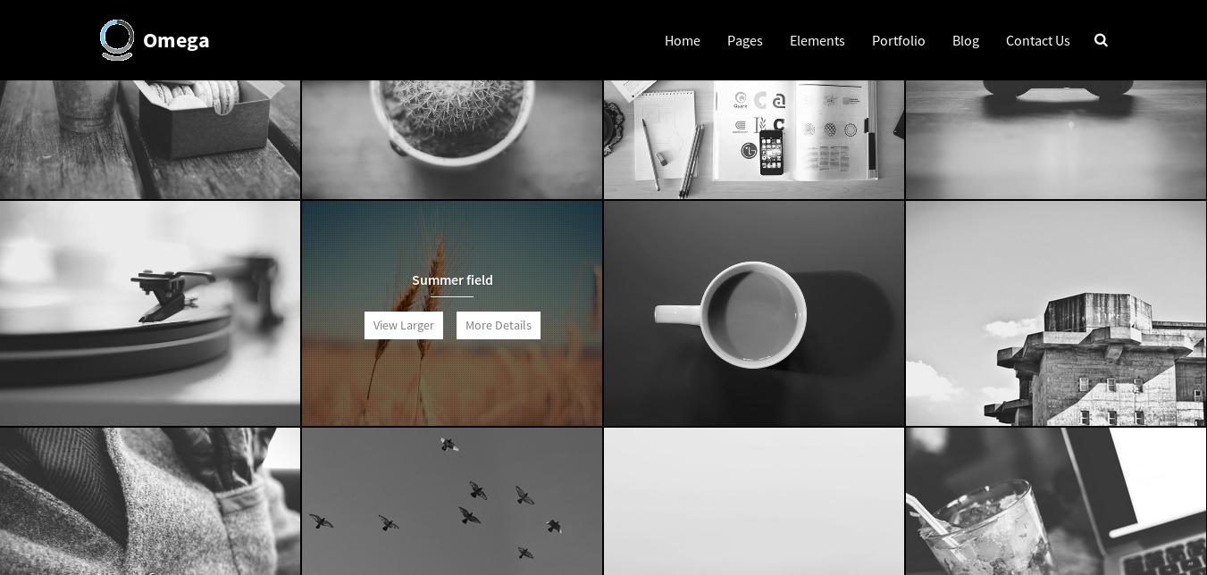
On hover overlay you can show a title and buttons instead of just an icon by using this markup
<div class="masonry-item portfolio-item isotope-item" data-menu-order="1" data-title="Coffee and Biscuits">
    <div class="figure portfolio-os-animation element-no-top element-no-bottom text-center figcaption-middle normalwidth image-filter-sepia fade-in image-filter-onhover" data-os-animation="fadeIn" data-os-animation-delay="0s">
        <span class="figure-image" target="_self">
            <img src="image_src" alt="Coffee and Biscuits" class="normalwidth">
            <div class="figure-overlay grid-overlay-30">
                <div class="figure-overlay-container">
                    <div class="figure-caption">
                        <h4 class="figure-caption-title element-small-bottom bordered bordered-small">
                            your title
                        </h4>
                        <p class="figure-caption-description">
                            <a href="image_src" class="btn btn-primary btn-sm magnific" target="_self">
                                View Larger
                            </a>
                            <a href="portfolio-slideshow.html" class="btn btn-primary btn-sm" target="_self">More Details</a>
                        </p>
                    </div>
                </div>
            </div>
        </span>
    </div>
</div>
Feel free to remove the <h4></h4> if you need just the buttons.
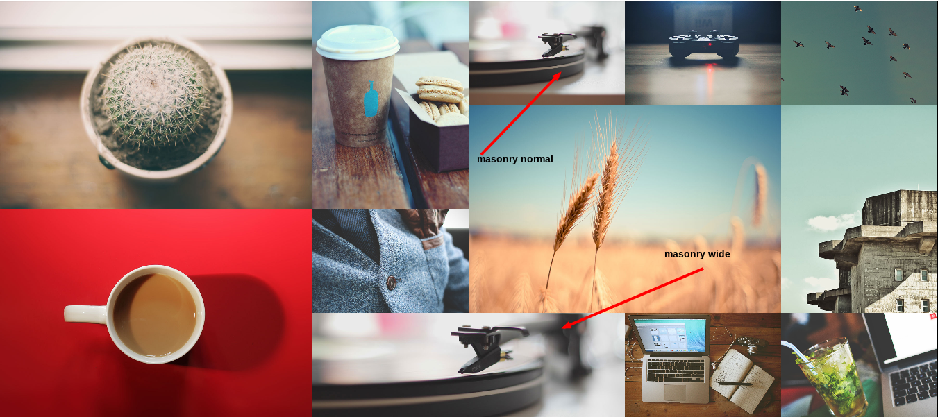
The masonry portfolio is a very cool option and is really easy to set up. All you need to do is add the use-masonry class and the data-layout="masonry" in the wrapping div to enable it, e.g.
 <div class="portfolio-container">
    <div class="portfolio masonry isotope use-masonry" data-padding="15" data-col-xs="2" data-col-sm="2" data-col-md="3" data-col-lg="3" data-layout="masonry">
    put the items here....
    </div>
</div>
When adding the portfolio items, you need to add an extra class to the <div class="masonry-item portfolio-item isotope-item">...</div> called masonry-normal or masonry-wide as
in <div class="masonry-item portfolio-item isotope-item masonry-wide">...</div>
Buttons in Omega follow the bootstrap markup as described on Bootstrap website. What is new in Omega is the extra icons that we can add on the left or right side of the buttons.
To add a simple icon you can use this markup
<a class="btn btn-primary" href="#">
<i class="fa fa-comment"></i>
Comment
</a>To add a fancy button you can use this markup
<a class="btn btn-lg btn-primary btn-icon-left" href="#">
    Buy it
    <span>
      <i class="fa fa-shopping-cart"></i>
    </span>
</a>
The icon can be put to the right if you change the btn-icon-left to btn-icon-right.
Omega offers a great element that you can shape as you want and choose the exact size that fits to your needs. Boxes can be either round, square or rectangle. This is the markup to be used for a round box
<div class="box-round box-big">
  <div class="box-dummy"></div>
  <span class="box-inner">
    <img alt="" data-animation="swing" src="img_src">
  </span>
</div>
To achieve the shape that you wish, you need to replace box-round with box-square or box-rect. In order to change the size of the box, change box-big(200x200) to box-mini(48x48), box-small(78x78), box-medium(100x100)
or box-huge(250x250). Also, you can set the background-color of each image by adding some inline styling in the .box-inner <div>.
Instead of an icon you can use an image
<div class="box-round box-big">
  <div class="box-dummy"></div>
  <span class="box-inner" style="background-color:#353b42;">
    <img alt="" data-animation="swing" src="img_src">
  </span>
</div>
To add an animation effect to the shaped images you can add a wrapping div to the icon/image with the box-animate class and a data attribute data-animation that sets the type of animation that you want e.g.
<div class="box-round box-big">
  <div class="box-dummy"></div>
  <span class="box-inner" style="background-color:#353b42;">
    <div class="box-animate" data-animation="swing">
      <img alt="" data-animation="swing" src="img_src">
    </div>
  </span>
</div>You can add social icons using the following markup
  <ul class="social-icons social-simple">
    <li>
      <a href="#">
        <i class="fa fa-twitter"></i>
      </a>
    </li>
    <li>
      <a href="#">
        <i class="fa fa-facebook"></i>
      </a>
    </li>
    <li>
      <a href="#">
        <i class="fa fa-pinterest"></i>
      </a>
    </li>
  </ul>
This will add a list of three social icons of a small size. You can change the class social-simple to social-big if you want them to be bigger.
The best way to present a list of important features is with a features list. Use the following markup
<ul class="features-list features-white">
  <li>
    <div class="features-list-icon">
        <img src="image_src" alt="some text">
    </div>
    <h3>Use lines</h3>
    <p>
        Omega is designed with the latest technologies so that your website will look sharp and stunning even on high resolution retina displays.
    </p>
  </li>
  .
  .
  .
</ul>
To change the background color of the featured list's items you can use the following classes: features-white, features-dark, features-blue, features-green, and features-gray.
Using the features-connected class inside th <ul> draws a line that connects the items, with the color of the data-linecolor attribute e.g.
<ul class="features-list features-white features-connected" data-linecolor="#82c9ed">You can create a blockquote by using the markup provided by bootstrap's official website.
However, you can have a fancy-blockquote with a shaped image at the bottom if you use the following markup
<blockquote>
  <p>
      Lorem ipsum dolor sit amet, consectetur adipisicing elit, sed do eiusmod tempor incididunt ut labore et dolore magna aliqua. Ut enim ad minim veniam, quis nostrud exercitation ullamco laboris nisi ut aliquip ex ea commodo consequat.
  </p>
  <div class="box box-round box-small">
      <div class="box-dummy"></div>
      <div class="box-inner">
          <img width="150" height="150" src="your_image">
      </div>
  </div>
  <footer>
      Jimmy Doe
  </footer>
</blockquote>All the elements in Omega can be animated. You can do that by adding the data-os-animation attribute that defines the type of animation to execute and the data-os-animation attribute that defines when the animation effect should take place. Also, the os-animation class should be added.e.g
<div class="figure text-center os-animation" data-os-animation="fadeIn" data-os-animation-delay=".2s">
...
</div>
This element will now animate 0.2 seconds after the user scrolls to it with the fadeIn effect.
When an element leaves a page while the user scrolls along the page, you can add a fade out effect, using the following data attributes:
You can use it for a header as in the following example:
<header class="text-left not-condensed" data-start="opacity:1" data-center="opacity:1" data-70-top-bottom="opacity:0">
    <h1 class="big hairline bordered-normal">
         a multi purpose and powerful HTML theme
    </h1>
</header>You can add bullet navigation to your page, making it easier for users to navigate to your sections by clicking to the respective bullet wherever they are on your page.
What you need to do to setup a bullet navigation is really simple. Add an id to any section that you want to have a bullet leading to it. Then you need to add this code to the bottom of the page
<div class="bullet-nav">
    <ul></ul>
</div>
Now there should be a bullet related to every section that has an id.
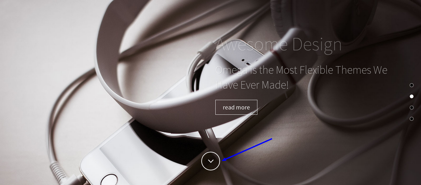
You can scroll to a section using a link, if you make the href attribute of the link point to the section. You also need to assign the scroll-to and scroll-to-id classes. For example, if the section's id is services, the link would be something like
<a href="#services" class="scroll-to scroll-to-id">
    <img src="your_image">
</a>
If you want to use the svg shown in the image below use the following markup
<a href="#services" class="scroll-to scroll-to-id place-bottom">
    <svg xmlns="http://www.w3.org/2000/svg" viewBox="0 0 100 100"><path fill="none" d="M65.473 42.382l-14.532 15.235-14.531-15.235"></path></svg>
</a>
Use the class place-bottom to place the svg to the bottom of the section.
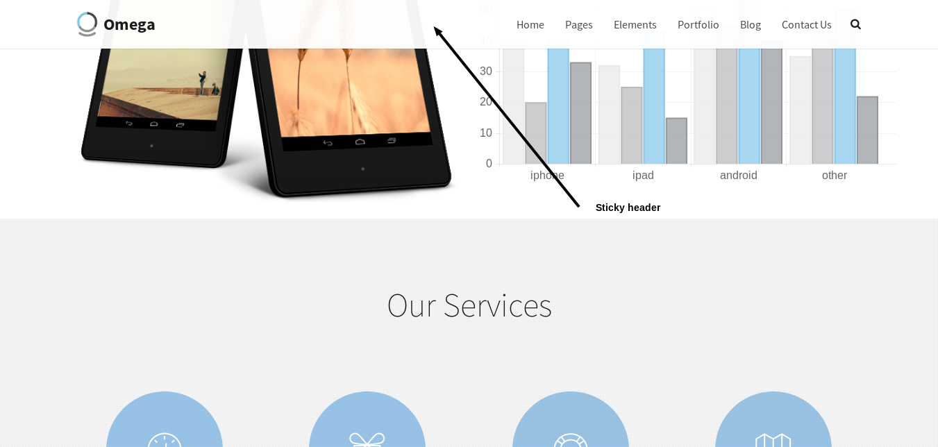
The charts in Omega are created with the Chartjs library. Please visit the official website for more info. Also, checkout the Corporate homepage of Omega.
Omega comes bundled with the Revolution Slider plugin. In order to be able to use it in your pages you need to make sure that :
You add the following lines to your HTML <head>
  <script type="text/javascript" src="http://ajax.googleapis.com/ajax/libs/jquery/1.9.0/jquery.min.js>
  <script src="assets/js/tools.min.js"></script>
  <script src="assets/js/revolution.min.js"></script>
<link href="assets/css/revolution.css" media="screen" rel="stylesheet" type="text/css" />The contact form now uses the PHPMailer, which is a full-featured email creation and transfer class for PHP. For more about PHPMailer please visit the official website
http://phpmailer.worxware.com/.
To setup your contact form you will need to edit the contact_mailer.php file in the main theme folder. The first 62 lines can be modified to customise your contact form.
smtp.gmail.com if you are using a GMail account. Other options are
smtp.live.com
smtp.mail.yahoo.com
smtp.mail.lycos.com
smtp.aol.com
some_email@email.com to the email that you want to use and secret to the password of that
email, from lines 16, 17.receiver@mail.com from line 21 to the address that you want.Set which fields are required - to change which fields are required in your form you can edit the following
 $field_rules = array(
  'name' => 'required',
  'email' => 'required|valid_email',
  'message' => 'required'
 );
Remove the lines of the fields you do not want to be required.
Change error validation messages - to change the error messages that popup on the forms change the following section
 $error_messages = array(
  'required' => 'This field is required',
  'valid_email' => 'Please enter a valid email address'
 );
 // select where each inputs error messages will be shown
 $error_placements = array(
  'name' => 'top',
  'email' => 'top',
  'subject' => 'right',
  'message' => 'right',
  'submitButton' => 'right'
 );
$error_messages - defines the messages shown in the popups.
$error_placements - defines where the popups will appear on (top|bottom|left|right).
<script src="assets/js/contact.min.js"></script> at the and of the <body>.
#