 Version: 1.5 | Last update: 5 May 2017
- Introduction
- Getting Started
- HTML Structure
- Layout
- Page Loading Transitions
- Logo
- Color Schemes
- Fonts
- Header & Topbar
- Sliders
- Helper Classes
- Twitter Widget
- Contact Form & Gmap
- Search bar
- Animations
- Icons
- Grid
- Browser Support
- FAQs
- Source & Credits
- Changelog
Introduction
Thank you for purchasing Polo template!
This documentation will give you an understanding of how POLO is structured and guide you in performing common functions. If you require further assistance not covered in this documentation, please contact us in our Support Portal http://support.inspiro-media.com/
If you need custom customization, please contact us from here: http://themeforest.net/user/inspiromedia
Thank you so much!
INSPIRO
Getting Started
Once you have download the package you will see the following folder structure:
- HTML - Template Files
- Documentation - Documentation
- Revolution + Visual Editor Addon - Revolution Slider and Revolution Slider Editor link for downloading files (if you use this slider
Installation
Follow the steps below to get started with your Site Template:
- Open the HTML Folder to find all the Templates Files
- You will need to Upload these files to your Web Server using FTP in order to use it on your Website or use an local server like wamp, xamp etc.
- Make sure you upload the required files/folders listed below:
- css - Main Stylesheet Files
- images - Images Files
- homepages - Homepages files, stylesheets, images (Use this folder only if you use one of the templates the rest directories inside this folder can be removed.
- js - Javacripts Folder (functions, jquery, plugins etc)
- include - PHP/Ajax Files (contact form, twitter etc
- audio - Audio Files
- video - Video Files
- fonts - Icon Fonts Files
- Now you are good to go, start adding content your website will be ready, unique and with style
HTML Structure
POLO template is based on Bootstrap Framework (http://getbootstrap.com/) Bootstrap is the most popular HTML, CSS, and JS framework for developing responsive, mobile first projects on the web.
Below is a sample coding structure:
<!DOCTYPE html> <html lang="en-US"> <head> </head> <body></body> </html>...
Layout Style
The template supports two different layout modes, Boxed & Wide Layout. The wide one is the default option, if you want to use the Boxed version, add the following class in the <body> and layout style will be changed to boxed version.
<body class="boxed">
Page Loading Transition
Page Loading Transitions are enabled by default. If you wish disable the page loading transition you can simply add this class no-page-loaderinside body.
<body class="no-page-loader">
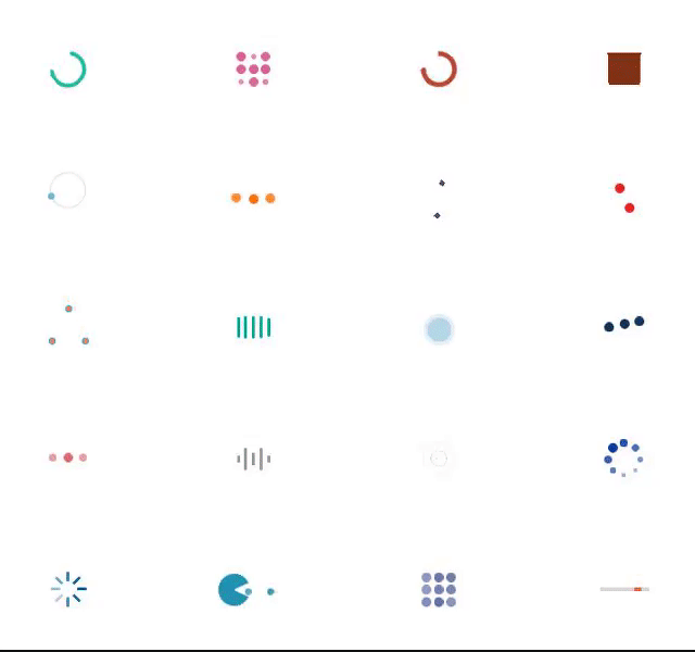
You can easily change page loaders in your website, simply by adding in body tag data-animation-icon="1" attribute and choose it from 1 to 20 styles. Full list of options below:
data-animation-in- Animation effect on page load, default value is fadeIndata-animation-out- Exit Animation effect when page is loaded, default value is fadeOutdata-animation-icon- choose it from 1 to 20 styles.data-animation-icon="1"data-icon-color- Add your custom hex code color exampledata-animation-icon="#ff0000"data-speed-in- Speed of Animation effect during the page load (in miliseconds), default value is 1000data-speed-out- Speed of Exit Animation Effect when page is loaded (in miliseconds), default value is 500
<body data-animation-in="fadeIn" data-animation-out="fadeOut" data-animation-icon="18" data-speed-in="1000" data-speed-out="500" data-animation-icon="#ff0000">
You can create custom link animation by adding this class .animsition-link inside the a tag
Logo Settings
Default site logo is placed inside #header container.
<header id="header"></header>
Note Maximum height of logo is 90px. Make you sure you also add
Retina Logo If you wish to use retina logo on your site for high-resolution retina displays, just place in the same direcory a high resolution file with name: logo@2x.png, and for dark version logo-dark@2x.png
Color Schemes
This part of the documentation will explain how to change the current Color Scheme of your site, You simply need to include an existing color scheme or change the HEX Color Code in the css/color-variations/custom.css and include inside <head>
Option 1 Including existin color palete:
Include inside <head> main template (or any predefined color palete). See example below:
<head>


</head>
Option 2: Changing the HEX Code in custom.css
Include inside <head> custom color palete from /css/color-variations/custom.css and open an code/text editor simply change the HEX Codes according to your requirements. See example below:
<head>


</head>
Changing Fonts
By default POLO Template uses Two fonts from google library:Open Sans and Raleway from the Google Fonts Library
If you wish to add/change the site fonts, please take a look in the head part of the website and you will find this tag:
To include new font you can simply add another line like this:
Or add an | seperator and paste Lato:400,300,800,700,600 after default website fonts link.
Header & Topbar Styles
Header
Polo has 15 header versions to choose from. Header versions helps you to customize the main header of your website with different styles. We made it really simple to change header styles, by simply changing a class name and your entire header style will change automatically and adopt to any screen.
Header Light is the default option, if you want to use the Transparent or dark version, add the following class in the <header> and header style will be changed to Transparent Header.
<header class="header-transparent">
Find below the list of Header Styles:
| Class | Class Description |
|---|---|
(Empty) |
This is the default Header style with white background and dark text color. There is no need to add a class for this version. |
.header-transparent |
This class will make header with with transparent background. By default header has text with dark color, in this case if you need to have text & menu with light color, you just need to add also header-dark after header-transparent |
.header-light |
This version of header is almost the same with the default version |
.header-light-transparent |
This class will make header with with light semi transparent background. By default header has text with dark color. |
.header-dark |
This class will make header with dark background and light text color |
.header-dark-transparent |
This class will make header with with dark semi transparent background. By default header has text with light color. |
.header-modern |
This class will make Modern floating Header style with white background and dark text color. |
.header-modern .header-dark |
These two classes will make Modern floating Header with dark background and light text color. |
.header-modern .header-dark .header-dark-transparent |
These two classes will make Modern floating Header with semi dark background and light text color. |
.header-modern .header-dark .header-dark-transparent |
These two classes will make Modern floating Header with semi dark background and light text color. |
.header-logo-center |
This class on default header version will align logo in center |
.header-logo-right |
This class on default header version will align logo in right position |
.header-fullwidth |
This class will make header to be fullwidth, if you need to be transparent, you can simply add header-transparent, also if you need to be with light color simply add also header-dark |
.header-static |
This class will make header to be as a static, when you scroll page the header size remain same. |
.header-no-sticky |
This class will disable sticky header, when you scroll page the header remain at top. |
.header-mini |
This class will make header to be as a mini version, similar as the sticky header when you scroll your page. |
Below slider (not class) |
You can add any of the above header styles under the slider in order to make it the header below slider. Simply grab the <header> ... </header> below <div id="slider"> ... </div> |
Topbar
Polo has 4 Topbar versions to choose from. Topbar versions helps you to customize the main Topbar of your website with different styles. We made it really simple to change Topbar styles, by simply changing a class name and your entire Topbar style will change automatically and adopt to any screen.
Topbar Light is the default option, if you want to use the Transparent or dark version, add the following class in the <div id="topbar"> and Topbar style will be changed to Transparent Topbar.
<div id="topbar" class="topbar-transparent">
Find below the list of Topbar Styles:
| Class | Class Description |
|---|---|
(Empty) |
This is the default Topbar style with white background and dark text color. There is no need to add a class for this version. |
.topbar-transparent |
This class will make Topbar with with transparent background. By default Topbar has text with dark color, in this case if you need to have text with light color, you just need to add also topbar-dark after topbar-transparent, see code on next colum |
.topbar-dark |
This class will make Topbar with with dark background and light text color |
.topbar-colored |
This class will make Topbar with with colored background. By default Topbar has text with dark color, in this case if you need to have text with light color, you just need to add also topbar-dark after topbar-colored, see code on next colum |
Sliders
POLO includes 5 different sliders that gives you all the options they need.
- Revolution Slider: is an awesome animated slider that creates eye-catching sliders.
- Owl Slider: Is an touch enabled jQuery plugin that lets you create beautiful responsive carousel slider.
- Polo Owl Slider: is an elegant slider perfect for large images and subtle animated titles and captions.
- Text Rotator: An simply text rotator that, creates small or large pieces of text one after the other, just like a slider does with images... This is a great tool for displaying catch phrases, mission statements, tag lines, and so on.
- Vegas Slideshow: Vegas is a jQuery/Zepto plugin to add beautiful backgrounds and Slideshows to DOM elements.
Revolution Slider
Please find the full online documentation of Revolution Slider here
Owl Slider
This excellent carousel slider can be controled usuing HTML5 data attirbutes, see the full list below:
data-carousel-col- The columns in large desktop screen size, default value is 4 columnsdata-carousel-col-md- The columns in laptop screen size, default value is 4 columnsdata-carousel-col-sm- The columns in tablet screen size, default value is 3 columnsdata-carousel-col-xs- The columns in mobile screen size, default value is 1 columnsdata-carousel-margins- Set space margins of elements, default value is 20 (20 pixels)data-carousel-dots- Use dots nativation, default value "false" in this case defult navigation are arrows in left and right.data-carousel-autoplay- Autplay slider, default value "false"data-carousel-video- Video slider, if you need to place video in slider you need to set this option to "true"
The full documentation of OWl Slider can be found here
Polo Owl Slider
You can easily add background images and text caption inside in Polo Owl Slider. You can also simply add inside <div id="slider">...</div> if you need it to be as a first slider of your website.
The HTML Structure of POLO Owl Slider is shown below:
The full documentation of OWl Slider can be found here
Text Rotator
Text Rotator can be controlled using HTML5 data attirbutes, see the full list below:
data-rotate-separator- Value of phrases seperator. Default value is "," You can change this value as you wish. Simply by adding an|or/data-rotate-effect- The [in] animation type. Refer to Animate.css for a list of available animations. Default value isflipInXdata-rotate-speed- The delay between the changing of each phrase in milliseconds. Default value is2000
Encapsulate your rotating phrases in an element and separate each phrase with a comma or a separator of your choice:
LIFE ISFITNESS, TO BE STRONG, TO BE FIT
The full documentation of Morphext can be found here
Vegas SlideShow
You can easily add animated background images to any element in your website. Simply place initialize code with ID of your target.
Below is an example:
								$(function() {
									$('body').vegas({
										slides: [
											{ src: 'img1.jpg' },
											{ src: 'img2.jpg' },
											{ src: 'img3.jpg' }
										]
									});
								});
Then the default target is body
If you wish to add in specific element you can simply use this code below:
Javascript code:...
								$(function() {
									$('#vegas-slideshow').vegas({
										slides: [
											{ src: 'img1.jpg' },
											{ src: 'img2.jpg' },
											{ src: 'img3.jpg' }
										]
									});
								});
The full documentation of Vegas Slideshow can be found at https://github.com/jaysalvat/vegas
Slider Helpers Classes
Find below list of css class helpers of sliders:
.fullscreen- This class makes the Slider Full Screen..halfscreen- This class change heigh of the slider to 1/2 of the screen. This class can be usued typically for fullwidth sliders.
Helpers
Polo helper css classes allow you to build your custom layout without touching any CSS code
These classes are generic helper classes predifined in the CSS of pages, here is quick view what they can do
- Set margins - Available for all directions from 0 - 150 px stepping value 5px
- Set padding - Available for all directions from 0 - 150 px stepping value 5px
- Set text color - Navigate below to table of Text Color to view the avaliable predefined classes
- Set text size - Navigate below to table of Text Sizes to view the avaliable predefined classes
- Set text align - Navigate below to table of Text Align to view the avaliable predefined classes
- Set font weight - Navigate below to table of Font Weight to view the avaliable predefined classes
Margins
You can add this helper class to any element in your HTML code to set Margins
| First Prefix ( m-*) | Second Prefix(m-t/b/l/r-*) | Last Prefix(m-t-$value) |
|---|---|---|
| m for margin | t : top, b : bottom, l : left, r : right | 5,10,15,20, ... 150 |
example :
m-t-10 which means Margin Top 10px
m-b-20 which means Margin Bottom 20px
m-l-5 which means Margin Left 5px
m-r-35 which means Margin Right 35px
Value can not be anything, 1,2,4,5,6. It has a step of 5px, eg: 5,10,15
Other options:
To remove margin from a HTML element add the class no-margin
Paddings
You can add this helper class to any element in your HTML code to set paddings
| First Prefix ( p-*) | Second Prefix(p-t/b/l/r-*) | Last Prefix(p-t-$value) |
|---|---|---|
| p for padding | t : top, b : bottom, l : left, r : right | 5,10,15,20, ... 150 |
example :
p-t-10 which means padding Top 10px
p-b-20 which means padding Bottom 20px
p-l-5 which means padding Left 5px
p-r-35 which means padding Right 35px
Value can not be anything, 1,2,4,5,6. It has a step of 5px, eg: 5,10,15
Other options:
To remove padding from a HTML element add the class no-padding
Text sizes
You can add this helper class to any element in your HTML code to set text size & style
| Text size | |
|---|---|
text-medium |
font-size: 50px !important; font-weight: 800; line-height: 1.1; margin-bottom: 20px; |
text-large |
font-size: 90px !important; line-height: 110px !important; font-weight: 800 !important; |
text-extra-large |
font-size: 120px !important; font-weight: 800; line-height: 120px; |
text-lg |
color: #ffffff; font-size: 130px; line-height: 120px; font-weight: 800; |
text-lg-x2 |
color: #ffffff; font-size: 230px; line-height: 250px; font-weight: 100; |
text-small |
font-size: 16px !important; font-weight: 800; line-height: 1.1; |
text-medium-light |
font-size: 50px !important; font-weight: 100; line-height: 1.1; |
text-large-light |
font-size: 90px !important; line-height: 100px !important; font-weight: 120 !important; |
Text Colors
You can add this helper class to any element in your HTML code to set text color
| Text | |
|---|---|
.text-orange
|
color: #f58a5c; |
.text-green
|
color: #1fbba6; |
.text-blue
|
color: #5f8295; |
.text-pink
|
color: #dd5a82; |
.text-purple
|
color: #dd5a82; |
.text-bricky
|
color: #894550; |
.text-yellow
|
color: #ffb848; |
.text-red
|
color: #e66b6b; |
.text-white
|
color: white; |
.text-dark
|
color: rgba(44, 47, 59, 0.4); |
.text-light
|
color: rgba(255, 255, 255, 0.6); |
Text Align
You can add this helper class to any element in your HTML code to set text align
| Text | |
|---|---|
.text-left
|
text-align: left; |
.text-right
|
text-align: right; |
.text-center
|
text-align: center; |
Font Weight
You can add this helper class to any element in your HTML code to set font weight
| Font Weight | |
|---|---|
.text-bold
|
font-weight: bold; |
font-wight-100
|
font-weight: 100 !important; |
font-wight-300
|
font-weight: 300 !important; |
font-wight-400
|
font-weight: 400 !important; |
font-wight-500
|
font-weight: 500 !important; |
font-wight-600
|
font-weight: 600 !important; |
font-wight-700
|
font-weight: 700 !important; |
font-wight-800
|
font-weight: 800 !important; |
Twitter Widget
You can control twitter widget simple by changing the attribute data-username
data-username- The data-username is your username on twitterdata-limit- Number of tweets to show (Default value: 2)
Twitter Widget Attributes
You can control Twitter Widget, simply by using HTML5 data attirbutes, follow list below:
data-username- Option to load tweets from another account or list owner's username.data-limit- Number of tweets you want to display (Default value: 2)data-format- Your date format (Default value: %b/%d/%Y)data-loading-text- Show profile image (Default value: false)data-loader- Path to your config.php file. (Default value: include/twitter/config.php)data-avatar- Show your avatar image (Default value: false)
Step 1 - Create Twitter Api Keys
- Visit https://dev.twitter.com/apps/ and log-in using your Twitter username and password.
- Select
Create new applicationand enter the application details.- Enter the name of the application, ex: POLO_Twitter_Widget
- Enter your website name. ex: www.inspirothemes.com
- Callback URL: leave it blank.
- Enter the CAPTCHA info and click create button.
- On the next details screen, click
Create my access token. You may need to refresh the page after a few seconds if it doesn't appear automatically. - Make a note of the Consumer key, Consumer secret, Access token and Access token secret as highlighted below.
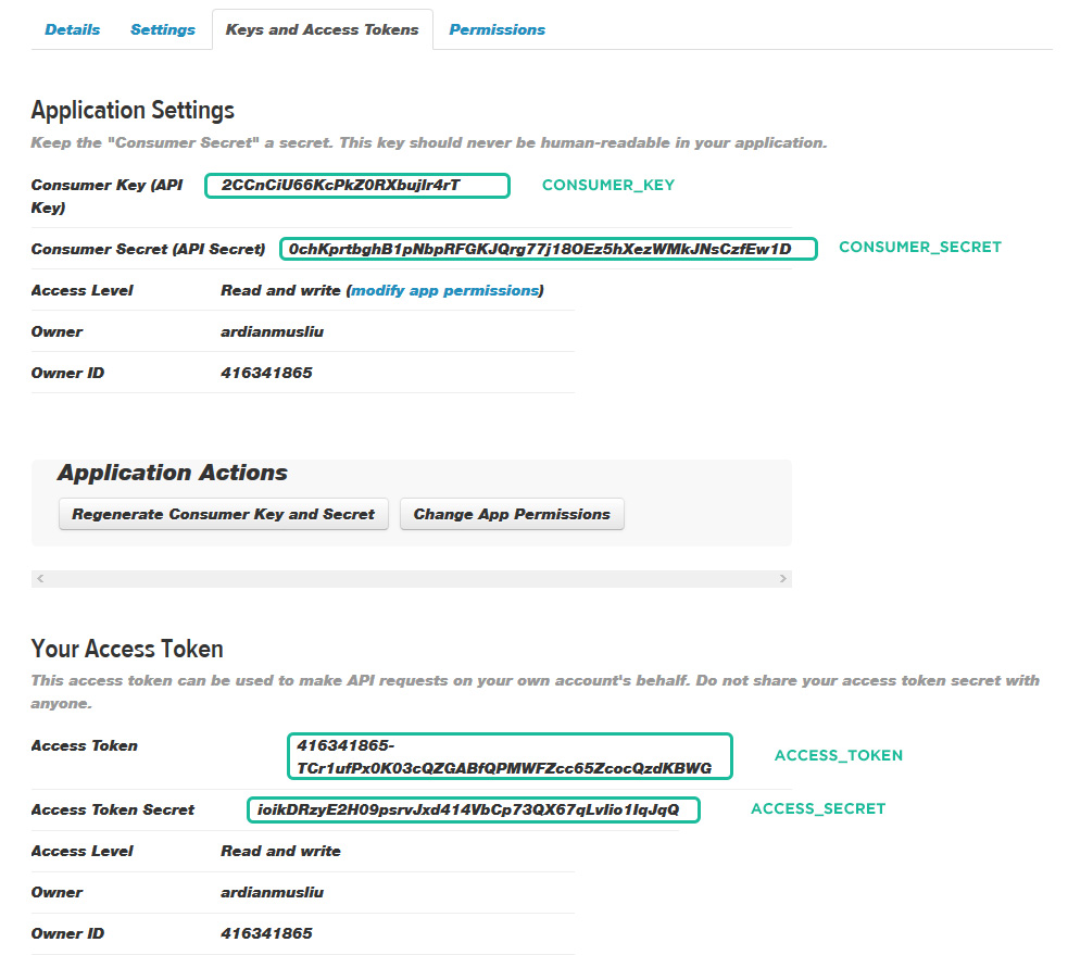
Step 2 - Enter Twitter Api Keys on config.php
- Open the
include/twitter/config.phpfile. - Enter your Twitter API Details as mentioned below:
1234567
// Consumer Keydefine('CONSUMER_KEY','CONSUMER_KEY_HERE');define('CONSUMER_SECRET','CONSUMER_SECRET_HERE');// User Access Tokendefine('ACCESS_TOKEN','ACCESS_TOKEN_HERE');define('ACCESS_SECRET','ACCESS_SECRET_HERE');
3. Save file. Done!
Contact form & Google Maps
Contact form
Simply go to /include/contact-form.php file and find line $to = "info@yourdomain.com" and add your email there. If you need multiple email recipes simply add a comma separation, example: email@domain.com, email2@domain.com
mail() function to make contact form work properly. And you need to upload to your web hosting server.
Not recieving emails?
If you are not receiving emails from your forms then chances are that your Server Configuration doesn't support PHP mail() function. But you can use SMTP Authentication. Just find the following line of code:
enable and configure these parameters inside contact-form.php
                //$mail->isSMTP();                                      // Set mailer to use SMTP
                //$mail->Host = 'mail.yourserver.com';                  // Specify main and backup SMTP servers, example: smtp1.example.com;smtp2.example.com
                //$mail->SMTPAuth = true;                               // Enable SMTP authentication
                //$mail->Username = 'SMTP username';                    // SMTP username
                //$mail->Password = 'SMTP password';                    // SMTP password
                //$mail->SMTPSecure = 'tls';                            // Enable TLS encryption, `ssl` also accepted
                //$mail->Port = 587;                                    // TCP port to connect to
reCaptcha Settings
To setup reCaptcha in your forms simply add this code below to your form
<script src="https://www.google.com/recaptcha/api.js"<script>
Contact map
You can create unlimited contact maps in your website. Simply by using HTML5 data attirbutes, follow list below:
data-map-address- Add location addressdata-map-zoom- Map zoom sizedata-map-typeThemaptypehas to be set as an string and can be set to any of these values:HYBRID,TERRAIN,SATELLITEorROADMAPdata-map-iconWe have created six markers for your website, you can find them in /images/markers. If you wish your custom image marker you can do that, just by placing your custom marker url indata-map-icon
An example, how to create Google Maps inside your website:
head or before your placed map. you can set the sensor parameter to true or false to detect the user's location.
Diqus comments
You will need to register your website with Disqus in order to make the disqus comments for on your website.
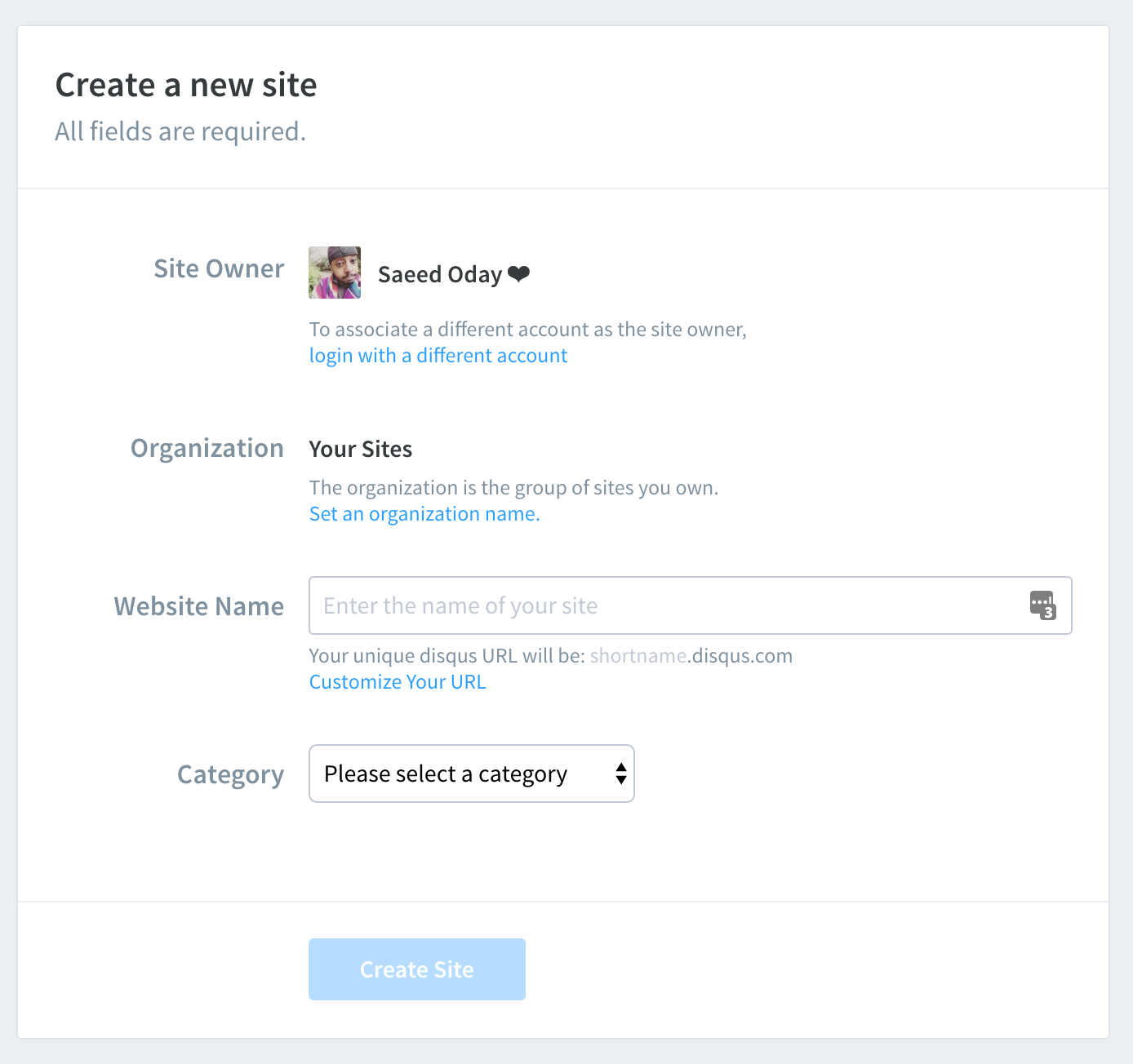
Step 1 - Create Disqus Account and register your site by visiting this url https://disqus.com/admin/create/Step 2 - Get the
disqus_shortname (Webiste Name, see screenshot below)
Step 3 - Add your
disqus_shortname (Webiste Name) in your template, example blog-comments-disqus.html
|
1
|
var disqus_shortname = 'YOUR_DISQUS_USERNAME'; |
Sample code of Disqus Comments
|
1
2
3
4
5
6
7
8
9
10
11
12
13
14
15
16
|
<!-- Disqus Comments --><div id="disqus_thread"></div><script type="text/javascript">// Add your disqus shortname - more info https://help.disqus.com/customer/portal/articles/466208var disqus_shortname = 'inspirothemes'; /// DO NOT THIS CODE BELOW (function() { var disqus = document.createElement('script'); disqus.type = 'text/javascript'; disqus.async = true; disqus.src = '//' + disqus_shortname + '.disqus.com/embed.js'; (document.getElementsByTagName('head')[0] || document.getElementsByTagName('body')[0]).appendChild(disqus);})();</script><!-- End: Disqus Comments --> |
Facebook comments
The Comments plug-in enables you to add a comments thread to any page on your website that allows visitors already logged in to Facebook to add comments.
Step 1 - Create a Facebook App. Relax, it’s not that scary :)
- Visit http://developers.facebook.com
- Login with your Facebook account
- Select Apps from the navigation menu and choose Create a New App
- Fill in the Display Name and select a category that matches your app
- Click Create App - You’ll now be taken to your App’s Dashboard page
- From your dashboard page, click Tab Setting and, add your info
- From your dashboard page, click App Review and check the "Comments public" to Yes
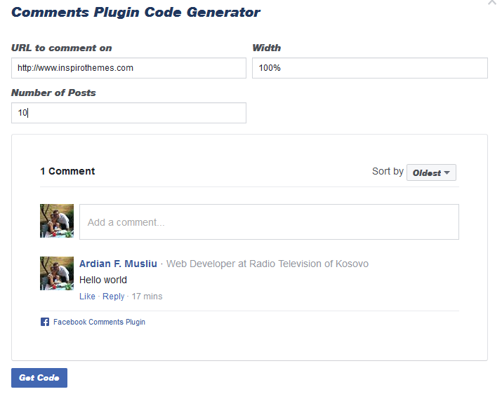
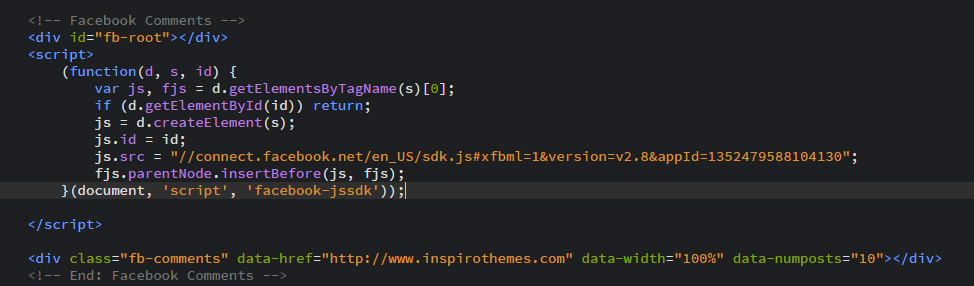
Step 2 - Get the comments code
- Visit https://developers.facebook.com/docs/plugins/comments/#configurator
- URL to comment on - add your site name
- Width - add value: 100%
- Number of Posts - Set to: 10
- Copy the code shown in the pop-up
- Repleace with existing one in your template, example in blog-comments-facebook.html
Search bar & Google custom search engine
If you allready have a google custom search engine created for your page, skip to step 2 (Search result page)
How to create a google custom search engine
- Login with your google account to http://www.google.com/cse/
- On the Google Custom Search home page, click New search engine.
- In the Sites to search section, add the pages you want to include in your search engine. You can include any sites you want, not just sites you own. You can include site URLs or page URLs, and you can also get fancy and use URL patterns. The name of your search engine will be automatically generated based on the URLs you select. You can change this name at any time.
- Select the language of your search engine. This defines the language of the buttons and other design elements of your search engine, but doesn't affect the actual search results.
- Click Create.
- To add your search engine to your site, click Get Code on the next page. Copy the code and paste it into your site wherever you want your Custom Search Engine to appear.
Search result page
Open search-results-page.html with an code/text editor, go to line 668 and add place google custom search code inside <div class="container">...</div>
An example, how the Google Custom Search page should look like:
Animations
You can easily add animations to any elements in your website. Animations can be shown on scroll appear and on click action for Out effect.
Example:
<div data-animation="fadeInUp" data-animation-delay="200">
...
</div>
data-animation-delay) is in miliseconds, example 1 second = 1000 miliseconds! It can be empty, default value is: 200 miliseconds
The animation can be set to:
- bounce
- flash
- pulse
- rubberBand
- shake
- swing
- tada
- wobble
- bounceIn
- bounceInDown
- bounceInLeft
- bounceInRight
- bounceInUp
- bounceOut
- bounceOutDown
- bounceOutLeft
- bounceOutRight
- bounceOutUp
- fadeIn
- fadeInDown
- fadeInDownBig
- fadeInLeft
- fadeInLeftBig
- fadeInRight
- fadeInRightBig
- fadeInUp
- fadeInUpBig
- fadeOut
- fadeOutDown
- fadeOutDownBig
- fadeOutLeft
- fadeOutLeftBig
- fadeOutRight
- fadeOutRightBig
- fadeOutUp
- fadeOutUpBig
- flip
- flipInX
- flipInY
- flipOutX
- flipOutY
- lightSpeedIn
- lightSpeedOut
- rotateIn
- rotateInDownLeft
- rotateInDownRight
- rotateInUpLeft
- rotateInUpRight
- rotateOut
- rotateOutDownLeft
- rotateOutDownRight
- rotateOutUpLeft
- rotateOutUpRight
- hinge
- rollIn
- rollOut
- zoomIn
- zoomInDown
- zoomInLeft
- zoomInRight
- zoomInUp
- zoomOut
- zoomOutDown
- zoomOutLeft
- zoomOutRight
- zoomOutUp
Icons font
We have included font awesome icon fonts in Polo template. A complete list of icons along with the class names can be found here: http://fontawesome.io/
You can place Font Awesome icons just about anywhere using the CSS Prefix fa and the icon's name. Font Awesome is designed to be used with inline elements (we like the <i> tag for brevity, but using a <span> is more semantically correct).
Please see below exmaple code:
Grid
Bootstrap grid includes a responsive, mobile first fluid grid system that appropriately scales up to 12 columns as the device or viewport size increases. It includes predefined classes for easy layout options, as well as powerful mixins for generating more semantic layouts
Grid systems are used for creating page layouts through a series of rows and columns that house your content. Here's how the Bootstrap grid system works:
- You must start with
row - There are pre-define classes of columns starting from 1 to 12, example
col-md-1tocol-md-12 - Each of these value represent a percentage of the screen, 1 being the smallest and 12 being 100%
- You can create different grid pattern that finally forms 12
For more information about Bootstrap, visit: http://getbootstrap.com/
example :
.col-md-1.col-md-1.col-md-1.col-md-1.col-md-1.col-md-1.col-md-1.col-md-1.col-md-1.col-md-1.col-md-1.col-md-1.col-md-8.col-md-4.col-md-4.col-md-4.col-md-4.col-md-6.col-md-6
Note Bootstrap includes different grids for different screen sizes, "col-md" md stands for medium screen, the following table explains:
| Extra small devices Phones (<768px) | Small devices Tablets (≥768px) | Medium devices Desktops (≥992px) | Large devices Desktops (≥1200px) | |
|---|---|---|---|---|
| Grid behavior | Horizontal at all times | Collapsed to start, horizontal above breakpoints | ||
| Container width | None (auto) | 750px | 970px | 1170px |
| Class prefix | .col-xs- |
.col-sm- |
.col-md- |
.col-lg- |
| # of columns | 12 | |||
| Column width | Auto | ~62px | ~81px | ~97px |
| Gutter width | 30px (15px on each side of a column) | |||
| Nestable | Yes | |||
| Offsets | Yes | |||
| Column ordering | Yes | |||
Browser Support
POLO is built keeping mind to support a wide range of browsers and devices. We all major browers Google Chrome, Mozilla Firefox, Safari, Opera, Internet Explorer 9 and Above
| Chrome | Firefox | Internet Explorer | Opera | Safari | |
|---|---|---|---|---|---|
| Android | Supported | Supported | N/A | Not Supported | N/A |
| iOS | Supported | N/A | Not Supported | Supported | |
| Mac OS X | Supported | Supported | Supported | Supported | |
| Windows | Supported | Supported | Supported | Supported | Not Supported |
FAQS
-
Why there are no images that were in live demo?
All images are only for demonstration purpose, however you can re-download them in sites we have listed in Credits section.
-
Why some videos might not work?
Ajax methods of Jquery are used for some videos and they can work only on the real server. For the correct operation of all functions, upload your website on a real server.
-
Why contact form may doesn’t work?
For the correct operation of contact form, the php support is necessary. Upload your website on a server with support of PHP and PHP mail() function.
Source & Credits
All images are only for demonstration purpose, however you can re-download them in sites below. Almost all (not including overclothing.com, Daniel Zenda, Freepik etc...) images are released free of copyrights under Creative Commons CC0.
Images & Mockups
- All Free Stocks http://allthefreestock.com
- The Stocks http://thestocks.im/
- Unsplash http://unsplash.com/
- Graphic Burger http://graphicburger.com
- Gratisography http://www.gratisography.com/
- Placeit https://placeit.net/c/people
- ImmagiPic http://www.immagipic.com/
- Graphberryhttp://www.graphberry.com
- Pixabay https://www.pixabay.com/
- Pexels https://www.pexels.com/
- Polygon Background http://blog.spoongraphics.co.uk/freebies/20-free-high-res-geometric-polygon-backgrounds
- Patterns http://subtlepatterns.com/
- Daniel Zenda https://www.flickr.com/photos/astragony/
- OVER Clothing https://overclothing.com/
- APP Concept (App Showcase) https://dribbble.com/shots/2056410-Let-s-Cook-Recipe-App-Design-Concept-Free-PSDs?list=searches
- Bakery Icons Cake vector designed by Freepik, Designed by Freepik, Cake vector designed by Freepik, Vintage vector designed by Freepik
Scripts
- Revolution Slider http://codecanyon.net/item/slider-revolution-responsive-jquery-plugin/2580848 - (Premium - Incuded with template, free license using inside Polo Template)
- Datetimepicker for Bootstrap 3 https://github.com/Eonasdan/bootstrap-datetimepicker/
- FitVids http://fitvidsjs.com/
- Isotope http://isotope.metafizzy.co
- Flickr Feed http://www.newmediacampaigns.com/page/jquery-flickr-plugin
- jQuery http://www.jquery.com/
- jQuery Appear https://github.com/bas2k/jquery.appear/
- Countdown http://keith-wood.name/countdown.html
- CountTo https://github.com/mhuggins/jquery-countTo
- Jquery Easing http://gsgd.co.uk/sandbox/jquery/easing/
- Easy pie chart http://github.com/rendro/easy-pie-chart/
- jQuery gMap 2 - Google Maps API V3 http://labs.mario.ec/jquery-gmap/
- Mb YTPlayer https://github.com/pupunzi/jquery.mb.YTPlayer
- Magnific Popup http://dimsemenov.com/plugins/magnific-popup/
- jQuery Mouse Wheel Plugin https://github.com/jquery/jquery-mousewheel
- multiScroll.js https://github.com/alvarotrigo/multiscroll.js
- Owl Carousel v2 http://www.owlcarousel.owlgraphic.com/
- particles.js https://github.com/VincentGarreau/particles.js
- Scrollify http://projects.lukehaas.me/scrollify/
- Simplr-smoothscroll https://github.com/simov/simplr-smoothscroll
- Stellar http://markdalgleish.com/projects/stellar.js
- Vegas Slideshow https://github.com/jaysalvat/vegas
- Vide https://github.com/vodkabears/Vide/
- jRespond https://github.com/scottjehl/Respond
- Moment.js https://github.com/moment/moment/
- Morphext http://morphext.fyianlai.com/
- Retina.js https://github.com/imulus/retinajs
- jQuery Form Plugin http://jquery.malsup.com/form/
- Bootstrap validator http://1000hz.github.io/bootstrap-validator/
- Let it snow http://www.jqueryscript.net/animation/Simple-Falling-Snow-Effect-with-jQuery-CSS3-let-it-snow.html
CSS & Fonts
- Bootstrap Framework http://getbootstrap.com/
- Animation http://daneden.github.io/animate.css/
- Font Awesome http://fortawesome.github.io/Font-Awesome/
- Google Fonts https://www.google.com/fonts
PHP
- PHP Mailer https://github.com/PHPMailer/PHPMailer
Changelog
V1.3 03 December 2015
- New Feature: Added new animated icon for resposnive menu
- Update: Added new animated icon on mobile menu
- Update: Fully functional contact form
- Update: Documentation
- BugFix: Side panel resposnive menu
- BugFix: Smooth scrolling issue fixed on IOS devices
- BugFix: Fixed preloader issue
- BugFix: Some other minor fixes
V1.2 28 Noveber 2015
- BugFix: Minor bug fixes
V1.1 28 Noveber 2015
- BugFix: Minor bug fixes
V1.0 27 Noveber 2015
Initial Release