You can set your default header options from the Omega->Pages menu, that will define a global header for your website. This can be applied to your
single staff,
portfolio,
service, and normal
pages.
The following options can be found under Omega->Pages menu:
- Show Header: Show or hide the header at the top of the page. If Show is selected, the options below will define the header of the portfolio item's single page.
- Header Type: Choose the type of header you want to use.
- Override section swatch: Set to On to override the swatch of the section.
- Heading Color: Set the color of the heading.
- Sub Header Font Size: Choose size of the font to use in your sub header.
- Header Font Size: Choose size of the font to use in your header.
- Header Font Weight: Choose weight of the font to use in the header.
- Header Alignment: Align the text shown in the header left, right or center.
- Header Condensed: Adds padding to the sides of the heading creating a more condensed effect.
- Header Underline: Adds an underline effect below the header.
- Underline Size: Size of the underline.
- Fade out when leaving page: Fades the heading out when the heading leaves the page.
- Extra Classes: Space separated extra classes to add to the heading.
- Margin Top: Amount of space to add above this element.
- Margin Bottom: Amount of space to add below this element.
- Swatch: Choose a color swatch for the section.
- Text Shadow: Adds a text shadow to all the text in this row.
- Inner Shadow: Adds an inner shadow to the inside of this row.
- Section Width: Choose between padded-non padded section.
- Optional class: Add an optional class to the section (separated with spaces).
- Optional id: Add an optional id to the section.
- Optional label: Add an optional label for this section, used in bullet nav tooltips.
- Overlay Colour: Set the colour of the video & image overlay.
- Overlay Opacity: Set the opacity of the video & image overlay.
- Overlay Grid: Adds an overlay pattern image.
- Background Video mp4: Enter url of an mp4 video to use for this rows background.
- Background Video webm: Enter url of a webm video to use for this rows background.
- Background Image: Choose an image to use for this rows background.
- Image Background Size: Set how the image will fit into the section.
- Image Background Repeat: Set how the image will be repeated.
- Background Position vertical: Set the vertical position of background video and image. 0 value represents the top horizontal edge of the section. Positive values will push the background down.
- Background Image Attachment: Set the way the background scrolls with the page. Scroll = normal Fixed = Parallax effect.
- Background Image Parallax Effect: Toggles the background image parallax effect.
- Parallax Effect Start Position: Sets the position of the image in pixels that the parallax effect will start from.
- Parallax Effect End Position: Sets the percentage of the image in pixels that the parallax effect will end up at.
- Background Color Animation Bundle: Choose a color bundle used to animate the section backgrounds.
- Background Color Animation Speed: Set the speed that the colors will change, in milliseconds.
- Background Color Animation Duration: Set the length of time each color will stay active between changes, in milliseconds.
- Section Height: Section will vertically cover the entire viewport if Full Height is selected.
- Section Transparency: Section will be tranparent if On is selected.
- Section Content Vertical Alignment: Align the content of the section vertically.
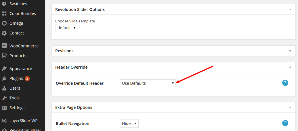
When editing a page, scroll down to the Header Override metabox. Set the Override Default Header dropdown to be Use Defaults. Your default header options will be applied. The same procedure
applies for
single staff,
portfolioand
servicepages.
Default colours
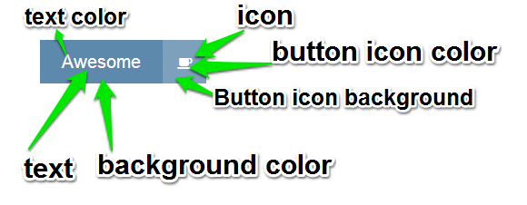
Here you can customize the colours for elements like the bootstrap button styles, portfolio hover colours, etc. The complete list of options include
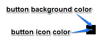
You can set up the text colour, background colour, hover background colour and icon button colours for each of the supported bootstrap button styles
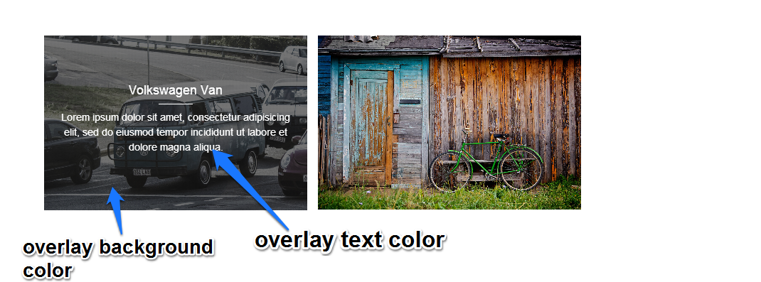
Overlay Colours
Set the colours used in overlay areas.
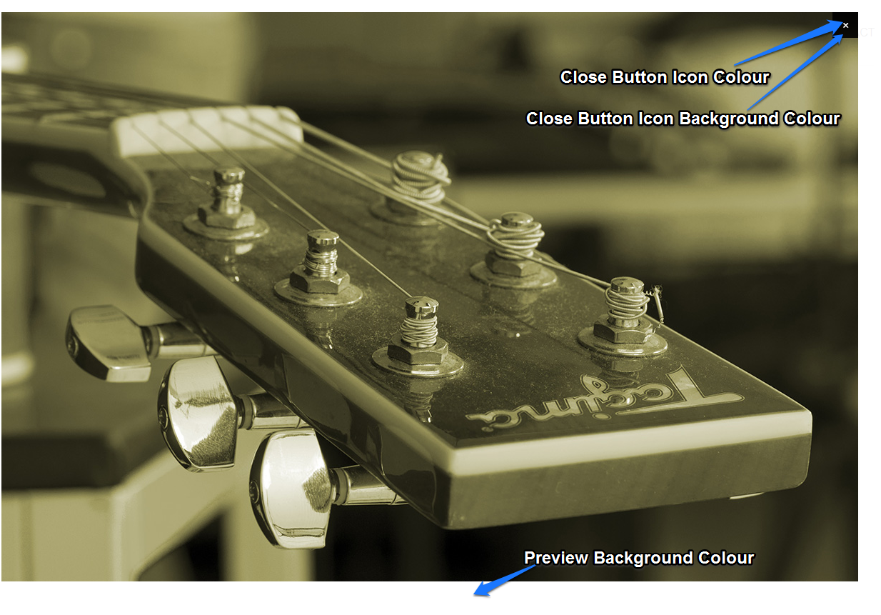
Magnific (image lightbox) Colours
Set the colours used in overlay when an image preview is clicked.
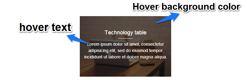
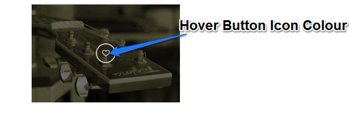
Portfolio Hover Colours
Set the colours used in portfolios when you hover over an item.
Set the colours of the go to top button. The go to top button will appear when you scroll down the page and allows users to navigate back to the top of the page.
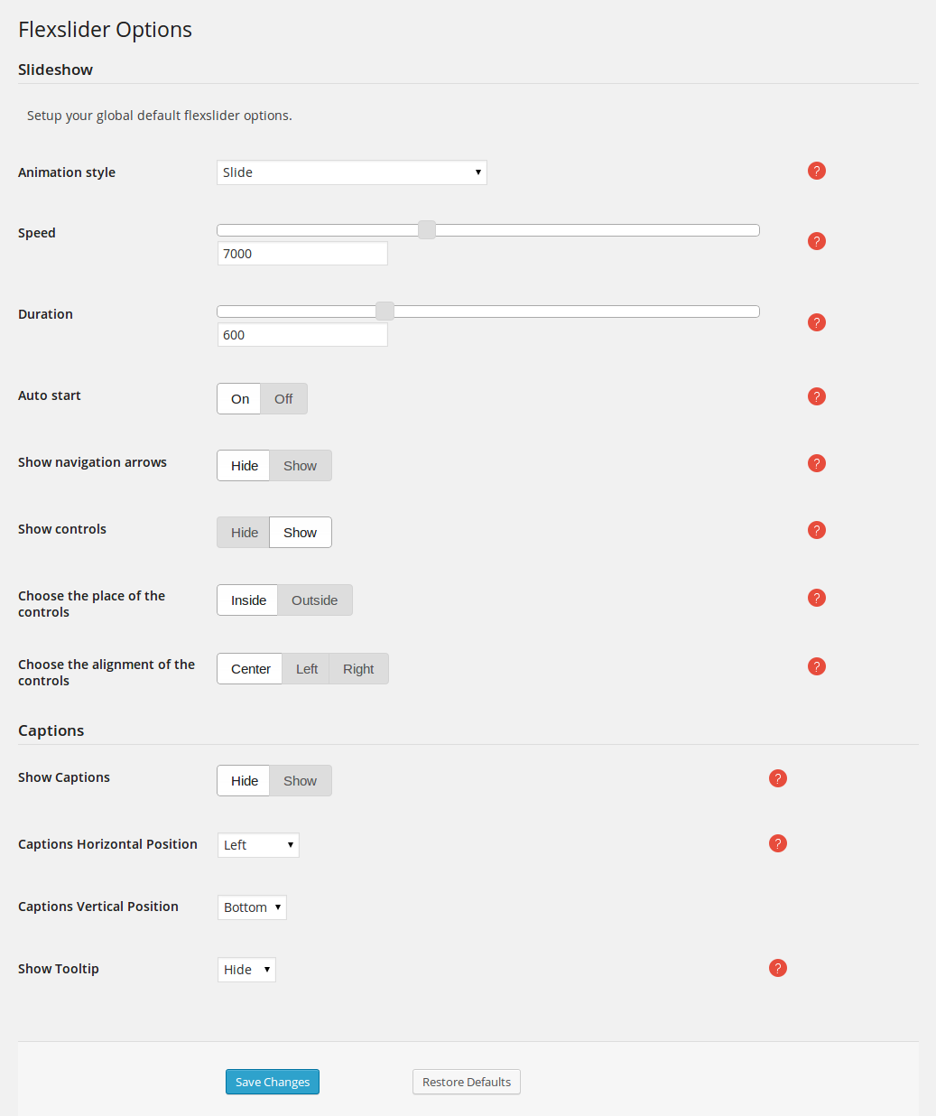
Flexslider
Here are the options that apply to the elements that use flexslider, like the gallery post types and portfolios.
You can read more about flexslider here
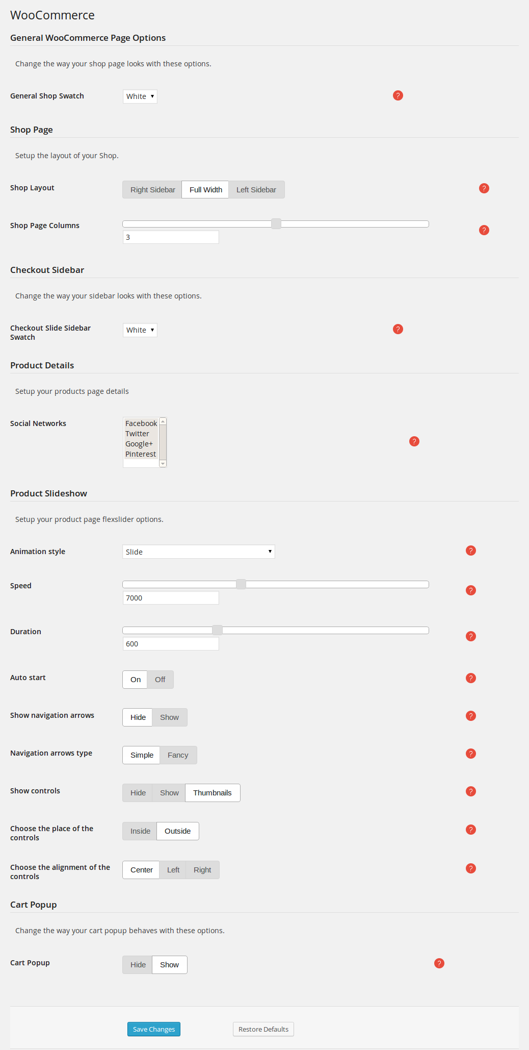
Woocommerce
The Omega->WooCommerce option on the left hand WordPress menu is where you set all the options of WooCommerce
Advanced options
Here you can find the advanced options for Omega theme:
- CSS: Here you can save some custom CSS that will be loaded in the header. This will allow you to override some of the default styling of the theme.
- Site Fav Icon: Here you can set up the favicons for all different devices.
- Mobile: Here you can configure settings targeted at mobile devices. For now, the only option available is to turn off mobile videos, as that will consume a lot of bandwidth.
- Google Analytics: Set your Google Analytics Tracker and keep track of visitors to your site.