Visual Composer
Omega uses the visual composer to easily allow you to create stunning sites. We recommend installing the Visual Composer plugin if you are creating complex pages like in our
demo sites.
Creating a page with the Visual Composer
The Pages menu option on the left is where you add pages. To add a new page, select the Pages > Add New option from the left hand WordPress menu. After typing your page's title you can select the page template
and start adding your content.
Omega comes bundled with Visual composer. Visual Composer is the most famous drag and drop page builder. You can take full control over your WordPress
site, build any layout you can imagine without any programming knowledge required.
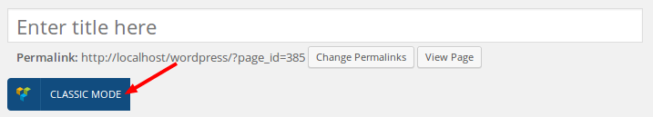
In order to enable visual composer, make sure you click on the button below the title, switching to
backend editormode.
Adding Sections
One of the great features of Omega theme is the use of multiple page sections. Think of a section as a partial in your page that you can add any type of content:
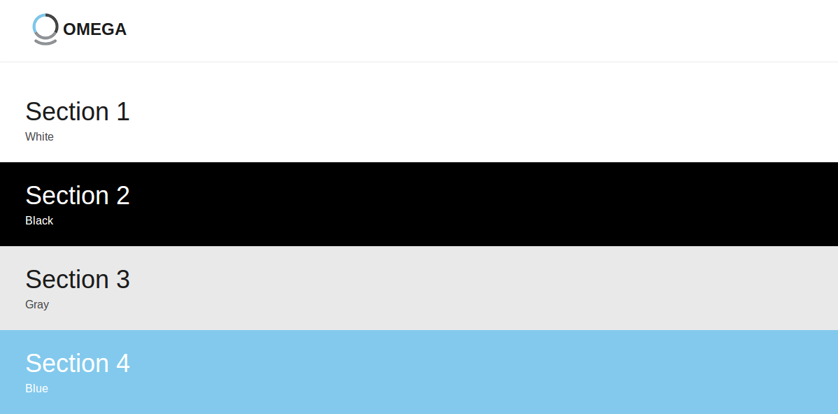
Each section can host its own content and even a different color swatch.
To use page sections with different colours, make sure that you have selected the default page template (full screen).
Before adding content to a new page, make sure you have created a new row. Turn the Visual composer on by clicking on the Backend editor button:
Then you can start adding content inside a row(section). Press the Add row button.
You have created an empty section. Before adding new elements to that section, try to edit it by clicking on the small pencil icon that is located on the upper right corner of the newly created row.
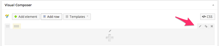
A list of options should now appear
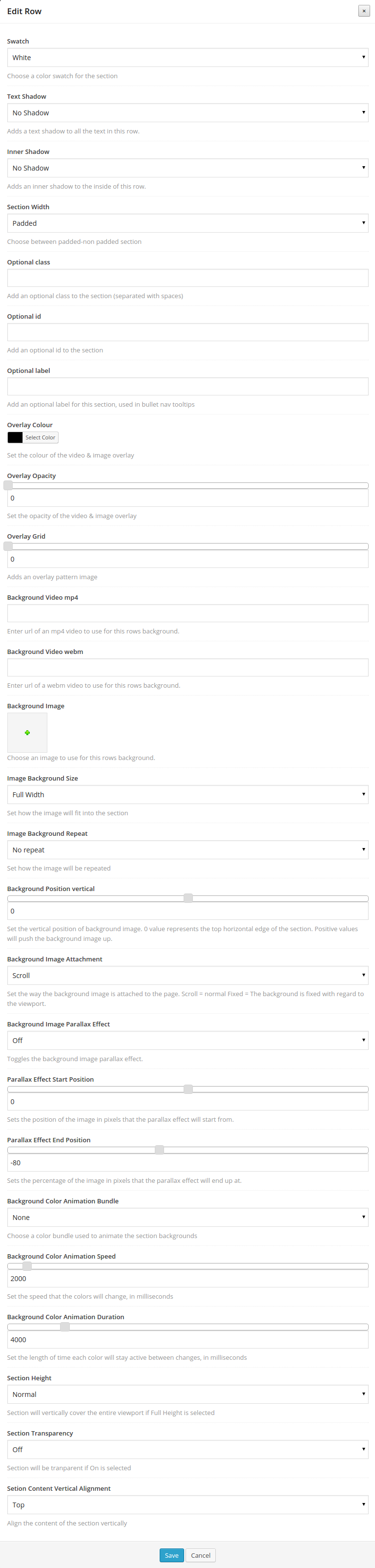
- Swatch: Choose a color swatch for the section. On how to set color swatches, take a look at the Color swatches section.
- Text Shadow: Adds a text shadow to all the text in this row.
- Inner Shadow: Adds an inner shadow to the inside of this row.
- Section Width: Choose between padded or full width section. If you want to have the content of the section extending to the edge of the screen use the full width section.
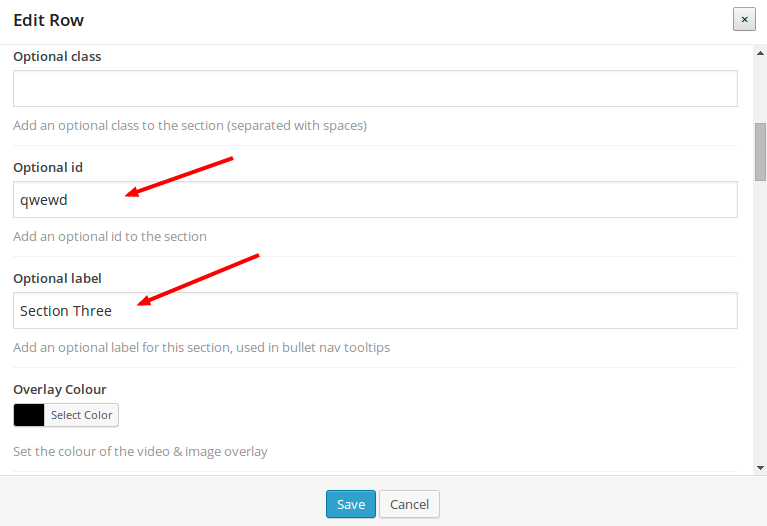
- Optional class: Add an optional class to the section (separated with spaces).
- Optional id: Add an optional id to the section.
- Optional label: Add an optional label for this section, used in bullet nav tooltips.
- Overlay Color: Set the color of a layer that overlays the video & image background.
- Overlay Opacity: Set the opacity of the overlay layer.
- Overlay Grid: Adds an overlay grid image in the overlay layer.
- Background Video mp4: Enter url of an mp4 video to use for this row's background.
- Background Video webm: Enter url of a webm video to use for this row's background.
- Background Image: Click on the plus sign in the middle of the frame. Add an image from the Media Library or upload a new one. This image will appear as the background view of your section. Once
added, you can see the preview icon in the options of the section. If you want to remove it, click on the x icon on the top right side of the image. You can only add one image background per section.
- Image Background Size: Set how the image will fit into the section.
- Image Background Repeat: Set how the image will be repeated.
- Background Position vertical: Set the vertical position of background video and image. 0 value represents the top horizontal edge of the section. Positive values will push the background down.
- Background Image Attachment: Set the way the background image is attached to the page. Scroll = normal Fixed = The background is fixed with regard to the viewport.
- Background Image Parallax Effect: Toggles the background image parallax effect.
- Parallax Effect Start Position: Sets the position of the image in pixels that the parallax effect will start from.
- Parallax Effect End Position: Sets the percentage of the image in pixels that the parallax effect will end up at.
- Background Color Animation Bundle: Choose a color bundle used to animate the section backgrounds.
- Background Color Animation Speed: Set the speed that the colors will change, in milliseconds.
- Background Color Animation Duration: Set the length of time each color will stay active between changes, in milliseconds.
- Section Height: Section will vertically cover the entire viewport if Full Height is selected.
- Section Transparency: Section will be tranparent if On is selected.
- Setion Content Vertical Alignment: Align the content of the section vertically.
Parallax Effect
In order to enable the Parallax effect on the background image of a section, you have to set the Background Image Parallax Effect option to On. Then, you should set the position of
the image in pixels that the parallax effect will start from and where it will end up at, by setting the Parallax Effect Start Position and Parallax Effect End Position respectively. This effect
will add an extra sense of interactivity between the user and your fabulous content!
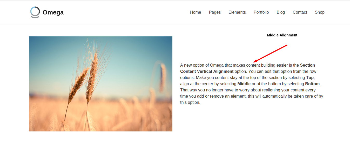
Content Vertical Alignment
A new option of Omega that makes content building easier is the Section Content Vertical Alignment option. You can edit that option from the row options. Make you content stay at the top of the section by selecting Top,
align at the center by selecting Middle or at the bottom by selecting Bottom. That way you no longer have to worry about realigning your content every time you add or remove an element, this will
automatically be taken care of by this option.
Keep in mind that the alignment will be applied to all the elements of that section.
Columns Layout
When building a section, before adding any content you should decide on how many columns you want to use.
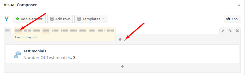 Then, click on the small pencil icon as pointed out in the image above to edit the Columns. You should now see the options below
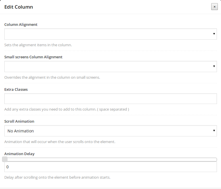
- Column Alignment: Sets the alignment items in the column.
- Small screens Column Alignment: Overrides the alignment in the column on small screens.
- Extra Classes: Add any extra classes you need to add to this column. ( space separated )
- Scroll Animation: Animation that will occur when the user scrolls onto the element.
- Animation Delay: Delay after scrolling onto the element before animation starts.
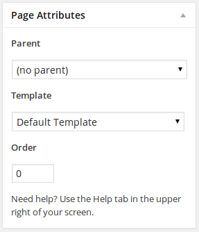
Page templates
When editing a page, below the Update button you can see the Page Attributes box. From there you can pick the template that you want your page to be styled with. Choose Right Sidebar or Left Sidebar,
if you have defined any widgets for the sidebar. If you want to use a full-width template, the Default Template is suitable, especially if you use different swatches for your sections. Alternatively, a Fullwidth Padded template
is provided for some padding on the left and right side of the page.
It is recommended to use the Default Template, if you do not plan to use sidebars.
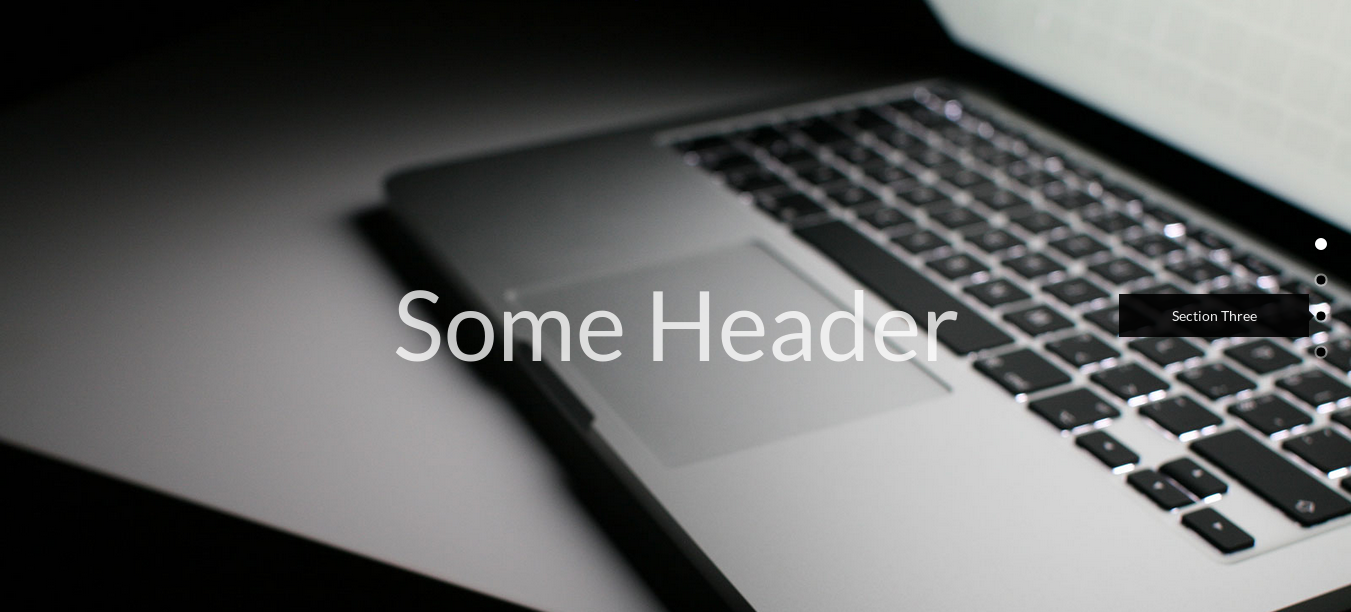
Bullet Navigation
A new feature of Omega that offers easier and smoother navigation from one section to another on every page is Bullet navigation. When enabled, every section of a page that has an id is assigned a
bullet. The bullet list shows on the right side of the page. When a bullet is clicked, the user navigates with a smooth scrolling effect to the section that this bullet is assigned to. In addition, if the user has set an Optional label when
editing the section, this label will show as a tooltip when the user hovers on the bullet.
To enable bullet navigation, do the following:
- Edit the page.
- At the bottom of the page locate the options Extra Page Options.
- Choose show for the Bullet Navigation and for the Bullet Show Tooltips if you want the tooltips to be shown.
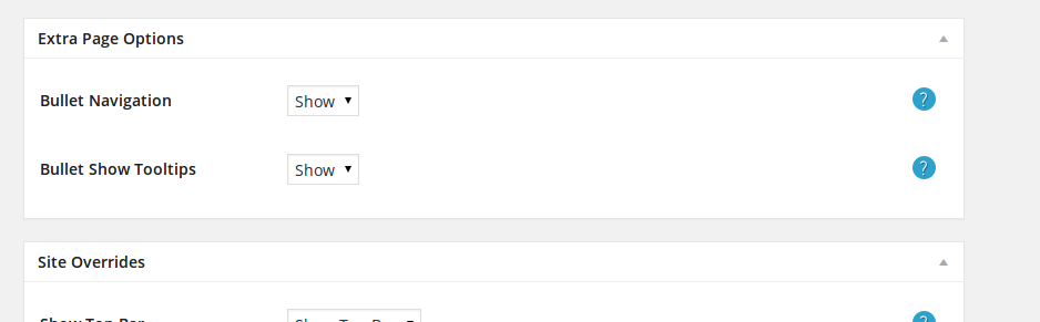
- When editing a section, add an id in the Optional id and a label in the Optional label field. That's all!
Page Overrides
For more flexibility Omega gives you a set of options to override some general settings:
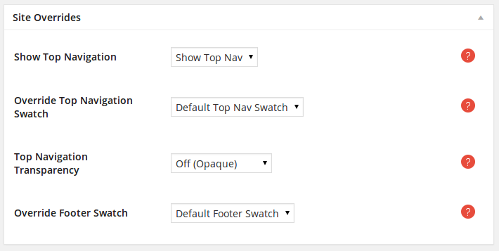
- Show Top Navigation: Show or hide the site's top navigation (ideal for landing pages or specific pages like maintenance mode page).
- Override Top Navigation Swatch: Override the default site top nav swatch (only for this page). Use this options to set up the page decoration on pages using the left or right sidebar template.
- Top Navigation Transparency: Make the sites top navigation transparent.
- Override Footer Swatch: Override the default site footer swatch (only for this page).
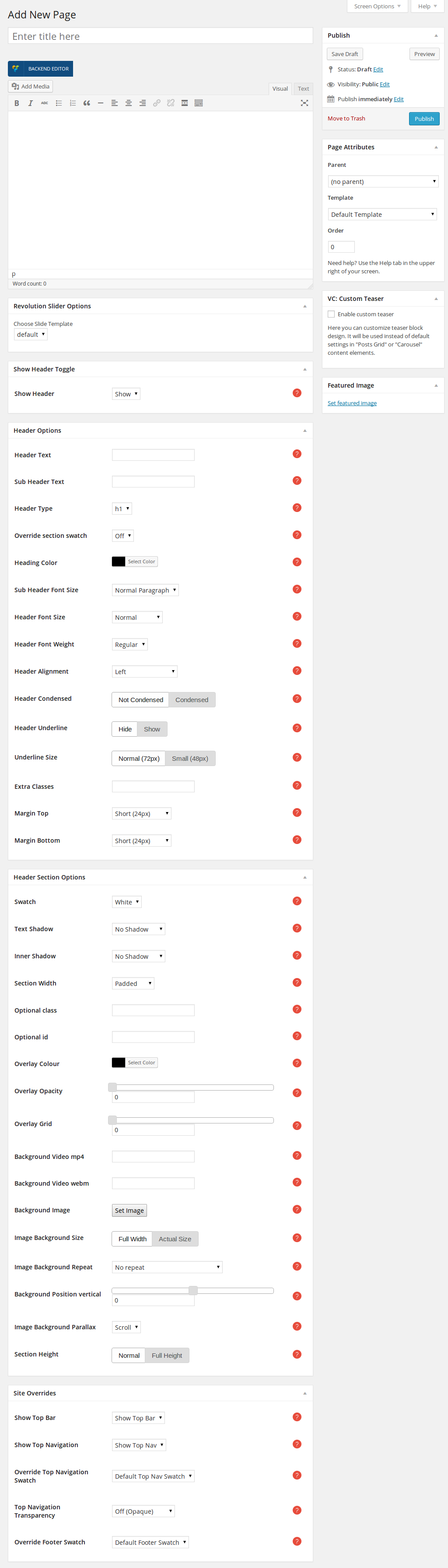
- Show Header: Show or hide the header at the top of the page. If Show is selected, the options below will define the header of the portfolio item's single page.
- Header Text: Text that will be used for the header.
- Sub Header Text: Text that will be used below the main header.
- Header Type: Choose the type of header you want to use.
- Override section swatch: Set to On to override the swatch of the section.
- Heading Color: Set the color of the heading.
- Sub Header Font Size: Choose size of the font to use in your sub header.
- Header Font Size: Choose size of the font to use in your header.
- Header Font Weight: Choose weight of the font to use in the header.
- Header Alignment: Align the text shown in the header left, right or center.
- Header Condensed: Adds padding to the sides of the heading creating a more condensed effect.
- Header Underline: Adds an underline effect below the header.
- Underline Size: Size of the underline.
- Fade out when leaving page: Fades the heading out when the heading leaves the page.
- Extra Classes: Space separated extra classes to add to the heading.
- Margin Top: Amount of space to add above this element.
- Margin Bottom: Amount of space to add below this element.
- Swatch: Choose a color swatch for the section.
- Text Shadow: Adds a text shadow to all the text in this row.
- Inner Shadow: Adds an inner shadow to the inside of this row.
- Section Width: Choose between padded-non padded section.
- Optional class: Add an optional class to the section (separated with spaces).
- Optional id: Add an optional id to the section.
- Optional label: Add an optional label for this section, used in bullet nav tooltips.
- Overlay Colour: Set the colour of the video & image overlay.
- Overlay Opacity: Set the opacity of the video & image overlay.
- Overlay Grid: Adds an overlay pattern image.
- Background Video mp4: Enter url of an mp4 video to use for this rows background.
- Background Video webm: Enter url of a webm video to use for this rows background.
- Background Image: Choose an image to use for this rows background.
- Image Background Size: Set how the image will fit into the section.
- Image Background Repeat: Set how the image will be repeated.
- Background Position vertical: Set the vertical position of background video and image. 0 value represents the top horizontal edge of the section. Positive values will push the background down.
- Background Image Attachment: Set the way the background scrolls with the page. Scroll = normal Fixed = Parallax effect.
- Background Image Parallax Effect: Toggles the background image parallax effect.
- Parallax Effect Start Position: Sets the position of the image in pixels that the parallax effect will start from.
- Parallax Effect End Position: Sets the percentage of the image in pixels that the parallax effect will end up at.
- Background Color Animation Bundle: Choose a color bundle used to animate the section backgrounds.
- Background Color Animation Speed: Set the speed that the colors will change, in milliseconds.
- Background Color Animation Duration: Set the length of time each color will stay active between changes, in milliseconds.
- Section Height: Section will vertically cover the entire viewport if Full Height is selected.
- Section Transparency: Section will be tranparent if On is selected.
- Section Content Vertical Alignment: Align the content of the section vertically.