Portfolios
Creating a portfolio item
The Portfolio Items menu option on the left is where you add portfolio items. To add a new portfolio item, select the Portfolio Items > Add New option from the left hand WordPress menu. The format of each portfolio
item that you wish to create, follows the same rules as the post types. Take a look at the next section for more info. When you create a new portfolio item, you need to setup a few more options.
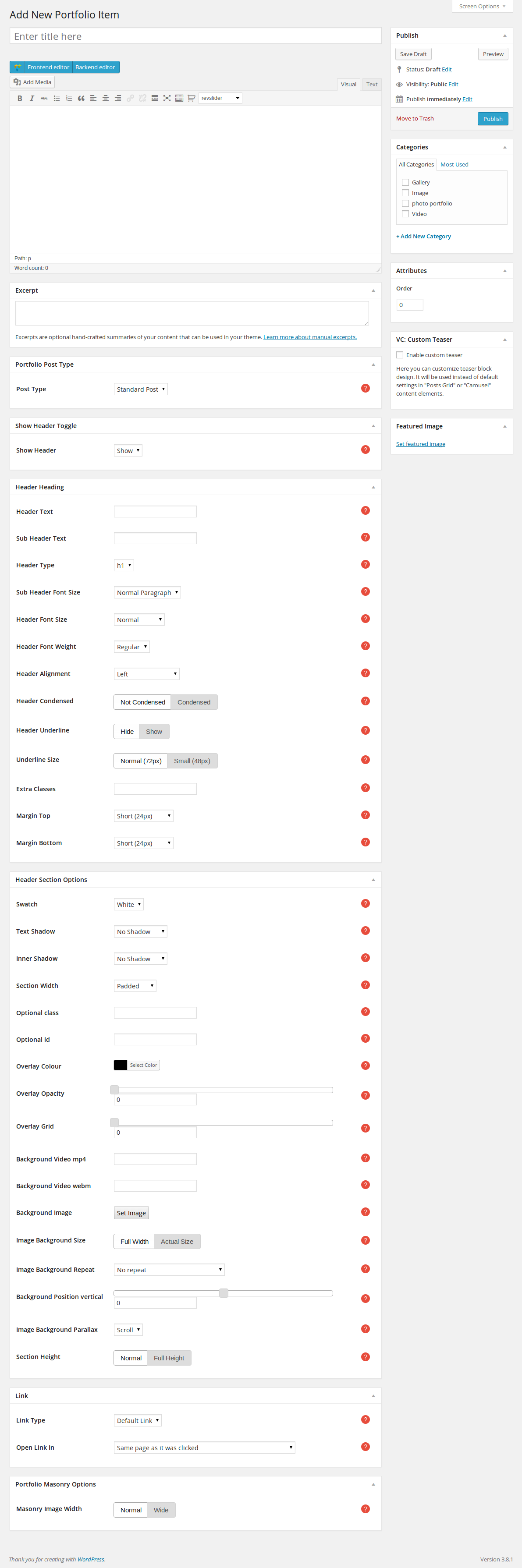
- Main Content: The content that you add in the editor of the portfolio item will be the single portfolio page that the item will link to, if the Default Link option is selected in the Link section
below, along with the Hover Overlay Link Type option set to Link in the shortcode.
- Excerpt: The summary of your portfolio item's content that will be shown when you add it as content to your pages.
Portfolio Post Type
Omega supports the following three portfolio item types:
- Standard Post: Used for text only (you should add featured image as well. All portfolio items should have a featured image).
- Video Post: Used for posts with a video. When selected, the Popup Video Link option will show up. Enter a youtube, vimeo or custom link to a video here. This will appear in the item's "view
larger" popup.
- Gallery Post: Used for portfolio items with a gallery included. When selected, the Popup Gallery option will show up. If you wish to add a gallery to your post, follow these steps
- press the Add Media button above the editor
- click on the Create Gallery option on the left-side menu
- pick the images that you wish to add to the gallery by clicking on them
- click on the Create a new gallery button
You can find out how to setup the Header Options in the Pages section here.
Link
- Link Type: Your portfolio item can link to a
- Default Link: the single portfolio page.
- Page: a page that you have created.
- Post: a post that you have posted.
- Portfolio: another portfolio item that you have created.
- Category: a category of posts.
- URL: an external URL.
- No Link: the portfolio item is not linkable.
- Open Link In: Where the link will open.
Portfolio Masonry Options
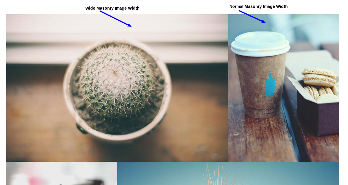
- Masonry Image Width: Select the width that the masonry portfolio shortcode will use for this item (normal 1 column wide 2 columns).
The following video will show you how to create different portfolio type items
Portfolio Shortcode
One of the most advanced features of Omega is the portfolio post type. You have numerous choices on how to make your work look spectacular. Take advantage of Omega's huge variety of layouts for your portfolio
items. Here is a step-by-step guide on how to create a portfolio section in a page( following the shortcode options from top to bottom):
- Pick a category of the portfolio items you want to show( or more than one is possible if you hold down the Ctrl key and click on the categories that you want ).
- Choose what filter you would like to use( or no filter ).
- Pick how many items you would like to show.
- As you might know, portfolio items appear in a page organized as columns. Your next move is to set into how many columns you would like your portfolio section to be divided. This, along with the previous option will affect
your layout the most. What is really cool about Omega at this point is that you can set a different amount of columns for different devices/screens. For e.g you can set a 6-column layout for really big screens,
whereas show a 2-column layout on small devices like tablets or mobile phones at the same time. Make your website responsive as you want it!
- Choose the padding that your items will have.
- Set the pagination to be on or off, with numbers or next/previous buttons. Only the number of items that you set on Step 3 will be shown on each pagination.
- Pick the size of each portfolio item.
- Decide on the type of overlay when hovering on the items.
- If you want only an icon, pick the Show Icon option and set it some options later in Item Overlay Icon.
- Pick Show Title & Caption if you want the title and the captions of the portfolio item. Remember, the captions are the Excerpt metabox that you fill in with text when you edit each portfolio
item(go here to read more about how to create a portfolio item).
- Pick Show Title Strip & Caption if you would like the title to be always visible, and the captions to show smoothly on hover.
- Pick Show Title & Buttons if you would like only the title and the buttons View Larger, More Details to become visible on hover.
- Pick Buttons Only if you would like only the buttons mentioned above to be visible on hover.
- Pick No Hover Overlay if you would not like to have an overlay effect on hover.
- Pick the type of the hover ovelay link. The first choice is Magnific, which will open a magnific popup of your portfolio item view, an image(for Standard Post), a gallery(for Gallery Post) or a video(for Video
Post). The second choice is Link, which will link the item to whatever is set to be the target when editing each portfolio item(go here to read more about how to create a portfolio item).
The third choice is No Link, when you do not want the items to be linkable.
- Decide if you want your captions to be visible only when hovering on the image of each portfolio item, or always under the image.
- According to the previous option, if your captions and title are visible below the image, you can now set a different link for them, the same way as in step 9.
- Set the caption's horizontal and vertical alignment.
- Pick what type of hover animation your overlay will have, as long as you have something other than No Hover Overlay selected in the Hover Overlay Type option above( step 8 ).
- Choose what type of effect filter you would like to apply( or none ) and when to apply that filter( when you hover in or out of the image ).
- Set an Item Overlay Grid ( the highest-the more visible )
- Set your animation options.
- Set the top/bottom margins for the section.
Masonry Portfolio Shortcode
The Masonry Portfolio Shortcode follows almost the same procedure as described for the simple portfolio shortcode. The main difference is that we dont set a number of columns for different screen resolutions. When editing a Portfolio
Item, at the bottom of the page we have an option called Masonry Image Width. If you choose Normal, the item will use one column, whereas if you choose Wide, it will use two columns.
Adding portfolios to a page
If you wish to add a portfolio section to your page, once you have created an empty row, follow these steps
- press the Add element button of the Visual Composer and choose the Portfolio element. Now you can edit the portfolio
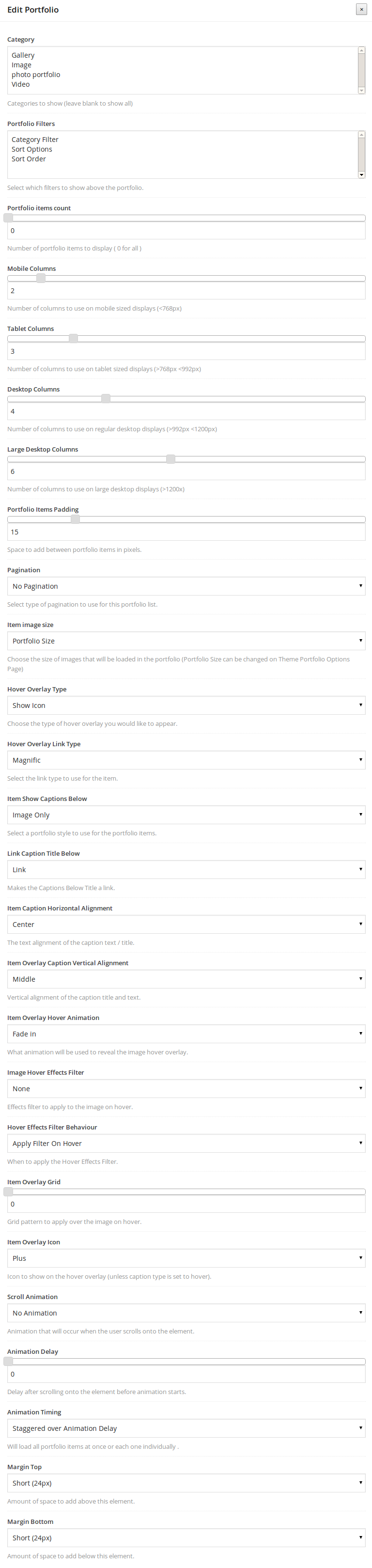
- Category: The categories of the portfolios that you wish to be shown(to pick more than one, hold down the ctrl button while clicking on the categories).
- Portfolio Filters: Select which filters to show above the portfolio.
- Portfolio items count: Number of portfolio items to display ( 0 for all ).
- Mobile Columns: Number of columns to use on mobile sized displays (<768px).
- Tablet Columns: Number of columns to use on tablet sized displays (>768px <992px).
- Desktop Columns: Number of columns to use on regular desktop displays (>992px <1200px).
- Large Desktop Columns: Number of columns to use on large desktop displays (>1200x).
- Portfolio Items Padding: Space to add between portfolio items in pixels.
- Pagination: Select type of pagination to use for this portfolio list.
- Item image size: Choose the size of images that will be loaded in the portfolio (Portfolio Size can be changed on Theme Portfolio Options Page).
- Hover Overlay Type: Choose the type of hover overlay you would like to appear.
- Hover Overlay Link Type: Select the link type to use for the item.
- Open Link In: Where the link will open.
- Item Show Captions Below: Select a portfolio style to use for the portfolio items.
- Link Caption Title Below: Makes the Captions Below Title a link.
- Item Caption Horizontal Alignment: The text alignment of the caption text / title.
- Item Overlay Caption Vertical Alignment: Vertical alignment of the caption title and text.
- Item Overlay Hover Animation: What animation will be used to reveal the image hover overlay.
- Image Hover Effects Filter: Effects filter to apply to the image on hover.
- Hover Effects Filter Behaviour: When to apply the Hover Effects Filter.
- Item Overlay Grid: Grid pattern to apply over the image on hover.
- Item Overlay Icon: Icon to show on the hover overlay.
- Scroll Animation: Animation that will occur when the user scrolls onto the element.
- Animation Delay: Delay after scrolling onto the element before animation starts.
- Animation Timing: Will load all portfolio items at once or each one individually.
- Margin Top: Amount of space to add above this element.
- Margin Bottom: Amount of space to add below this element.
Masonry portfolio
If you wish to add a masonry portfolio section to your page, once you have created an empty row, follow these steps
- press the Add element button of the Visual Composer and choose the Masonry Portfolio element. Now you can edit the portfolio
- Category: The categories of the portfolios that you wish to be shown(to pick more than one, hold down the ctrl button while clicking on the categories).
- Portfolio Filters: Select which filters to show above the portfolio.
- Portfolio items count: Number of portfolio items to display ( 0 for all ).
- Portfolio Items Padding: Space to add between portfolio items in pixels.
- Pagination: Select type of pagination to use for this portfolio list.
- Item image size: Choose the size of images that will be loaded in the portfolio (Portfolio Size can be changed on Theme Portfolio Options Page).
- Hover Overlay Type: Choose the type of hover overlay you would like to appear.
- Hover Overlay Link Type: Select the link type to use for the item.
- Open Link In: Where the link will open.
- Image Hover Effects Filter: Effects filter to apply to the image on hover.
- Hover Effects Filter Behaviour: When to apply the Hover Effects Filter.
- Item Caption Overlay Horizontal Alignment: The text alignment of the caption text / title.
- Item Overlay Caption Vertical Alignment: Vertical alignment of the caption title and text.
- Item Overlay Hover Animation: What animation will be used to reveal the image hover overlay.
- Item Overlay Grid: Grid pattern to apply over the image on hover.
- Item Overlay Icon: Icon to show on the hover overlay.
- Scroll Animation: Animation that will occur when the user scrolls onto the element.
- Animation Delay: Delay after scrolling onto the element before animation starts.
- Animation Timing: Will load all portfolio items at once or each one individually.
- Margin Top: Amount of space to add above this element.
- Margin Bottom: Amount of space to add below this element.
Portfolio Options
The general settings for the portfolios can be found in Omega>Portfolio
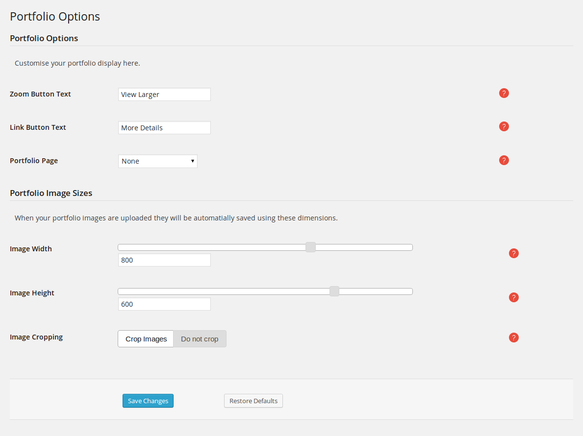
- Zoom Button Text: This text will be shown in the portfolio item zoom button.
- Link Button Text: This text will be shown below the portfolio item link button.
- Portfolio Page: Make all your portfolio single pages link back to a main portfolio list page.
Portfolio Image Sizes
- Image Width: Width of each portfolio item image (default 800px).
- Image Height: Height of each portfolio item image (default 600px).
- Image Cropping: Option to crop images to the exact proportions.